Retail With Clarity
Bringing clarity to retail
Same clarity, a bolder voice. A brand refresh and Squarespace website design that moves a retail merchandising consultancy from calm boutique to confident challenger.
Project scope
Brand identity design
Squarespace website design
Digital templates
Creative direction + design
Andrea Boughton
Photography
Kate Lindeman
Copywriting
Megan Rose Freelance
The challenge
Retailers have a real passion for what they sell. The numbers that drive their profits don’t always get the same attention.
Enter Claire Morris. As founder of retail merchandising consultancy Retail With Clarity, she works with retailers to maximise their profits. That means planning ranges, setting prices and making sure they hold the right amount of stock.
Claire was nicknamed ‘Clarity’ during her corporate merchandising days, so it was the natural choice for her business name. I designed her original brand identity and website when she first launched in 2018. Back then, the focus was independent boutique retailers, many of whom didn’t know merchandising support existed. A calm, boutique feel made sense.
Seven years on, the business looks quite different. As well as independents, Claire now partners with well-known names such as Neal’s Yard Remedies and Fenwick. These clients understand merchandising and value the service. Claire asked me to refresh the brand so it speaks to them more directly and works harder for her business.

Brand audit and strategy – building on what works
A refresh works best when it starts with what you already have, so I began with a brand audit. We then set three goals: align the brand with where the business is heading, make it clearer and more distinctive without losing recognition, and improve accessibility.
The audit showed there was plenty worth keeping. The lozenge logo mark and wave pattern had built brand recognition over seven years, so they stayed. What had to change was the feel. The calm, boutique style no longer matched Claire’s clients, so the brand became a challenger: more direct, bolder, still warm, and all about clarity.
I streamlined the brand traits into three, each shaping the identity refresh:
Clarity: direct, honest, human
Confident: knowledgeable, assured, credible
Grounded: practical, warm, approachable
Accessibility matters more than ever, so I built it into every asset, from colour contrast to type hierarchy. That feels fitting for a brand built on making things clear.
A bolder, clearer visual identity
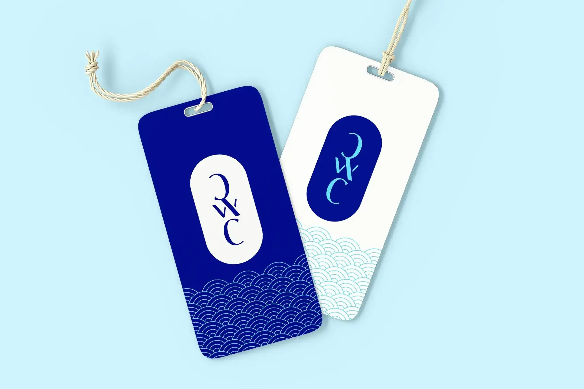
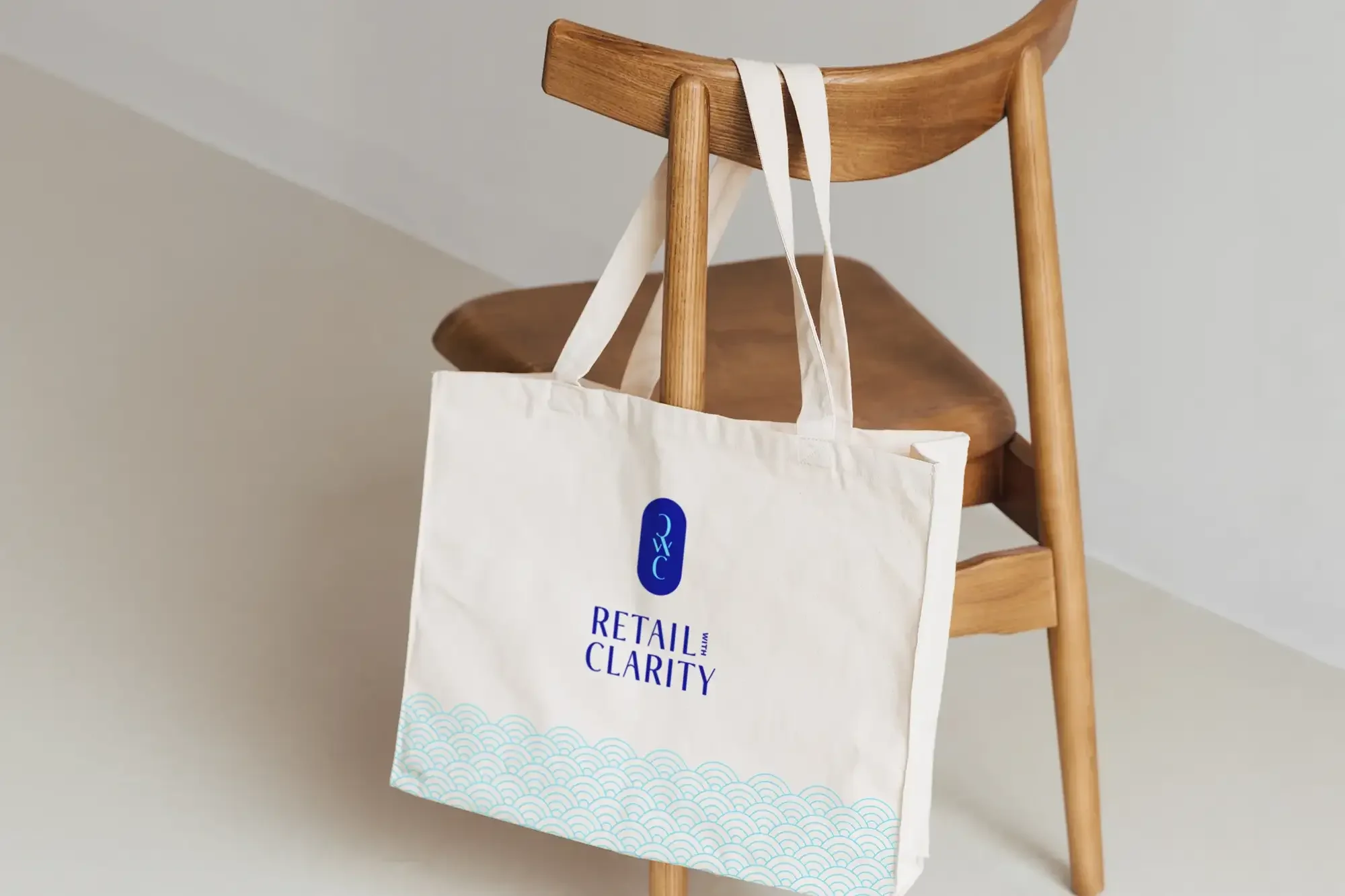
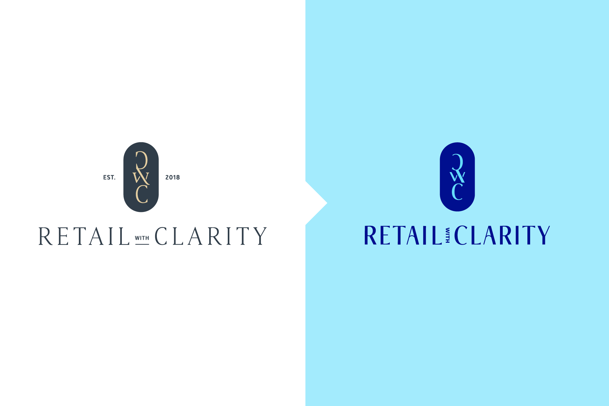
I evolved the logo, making it bolder and more contemporary, using a typeface with high stroke contrast and subtly flared terminals to keep the original’s refined character.
A narrower width and a vertical ‘with’ make the new logo more compact and practical to apply, while multiple lockups add flexibility. The lozenge stays. Details such as the crossbars of the ‘A’s and the curved letterforms echo the lozenge shape, adding warmth and continuity.
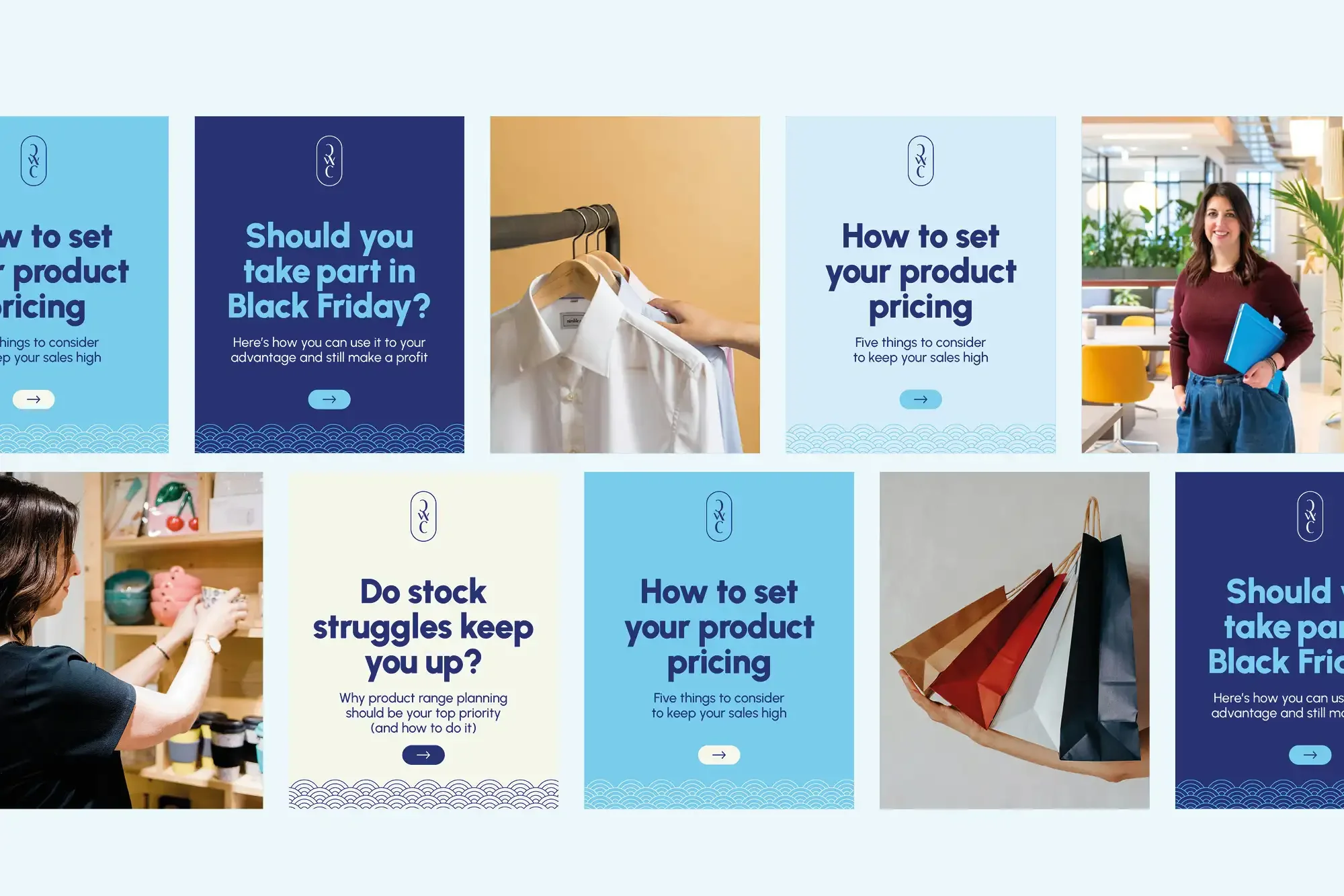
The biggest change was colour. For a direct feel, I moved the palette from soft and muted to bright and clear, with winter gem blues balanced by warm autumn accents:
Deep sapphire communicates clarity and trust.
Bright topaz adds vibrancy and practical contrast.
Lighter neutral tints give designs breathing space.
Gold and garnet accents, used selectively, add warmth so the palette never feels flat or icy.
I also checked colour pairings against WCAG (Web Content Accessibility Guidelines) 2.2 AA standards, so the palette works for as many people as possible.
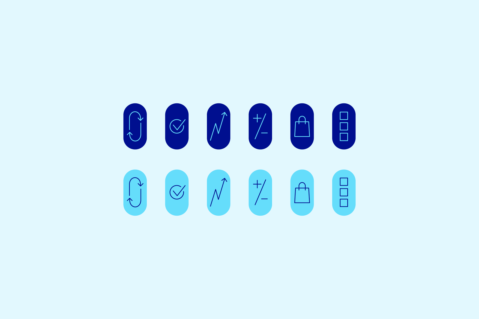
I simplified the type hierarchy to balance personality with readability and refined the signature wave pattern to sit comfortably with the bolder style. A new icon set brings the content to life, making it more visually engaging and easier to take in.
Art direction – showing the face behind the brand
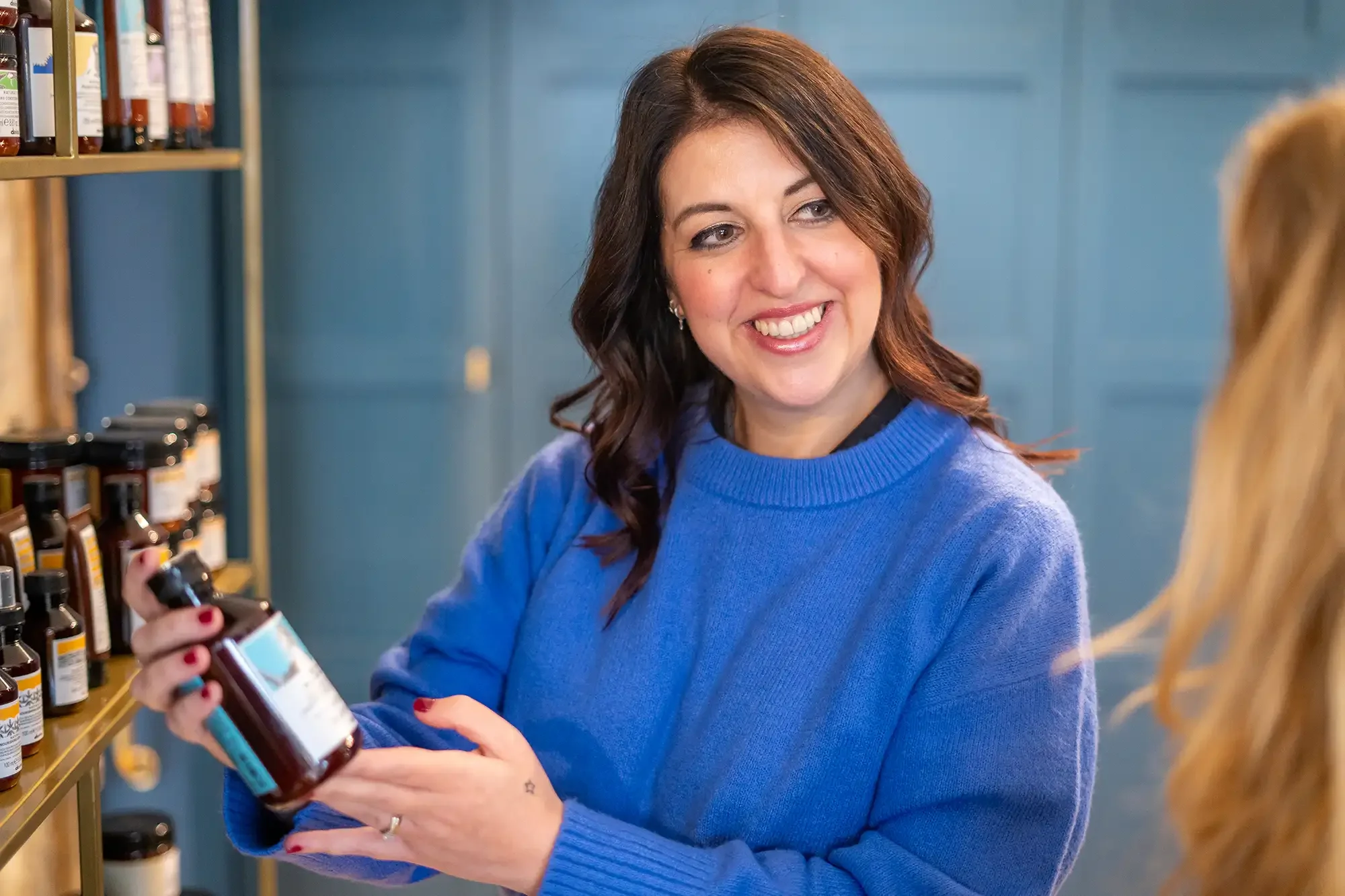
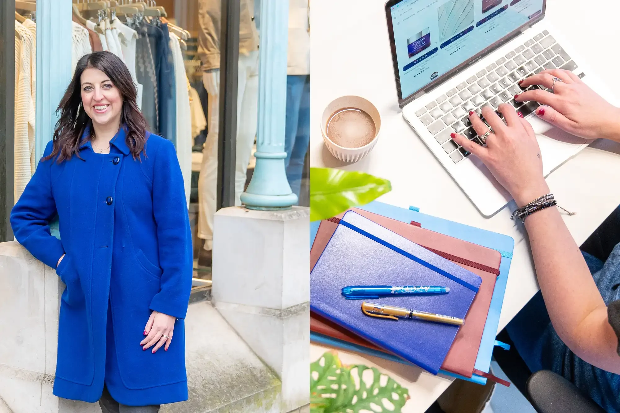
A big part of the project was planning and art directing a new photoshoot with photographer Kate Lindeman. I planned the shoot across a mix of locations to show Claire where her work happens: retail settings, a coworking space and the high street.
I directed each shot to bring out the brand’s confident, grounded personality. The result is a library of authentic imagery that puts Claire at the heart of the brand and creates connection, because people buy from people. It also adds a human touch to the website and marketing materials, so the brand feels as approachable as Claire is.
Squarespace website design – lean, clear and easy to manage
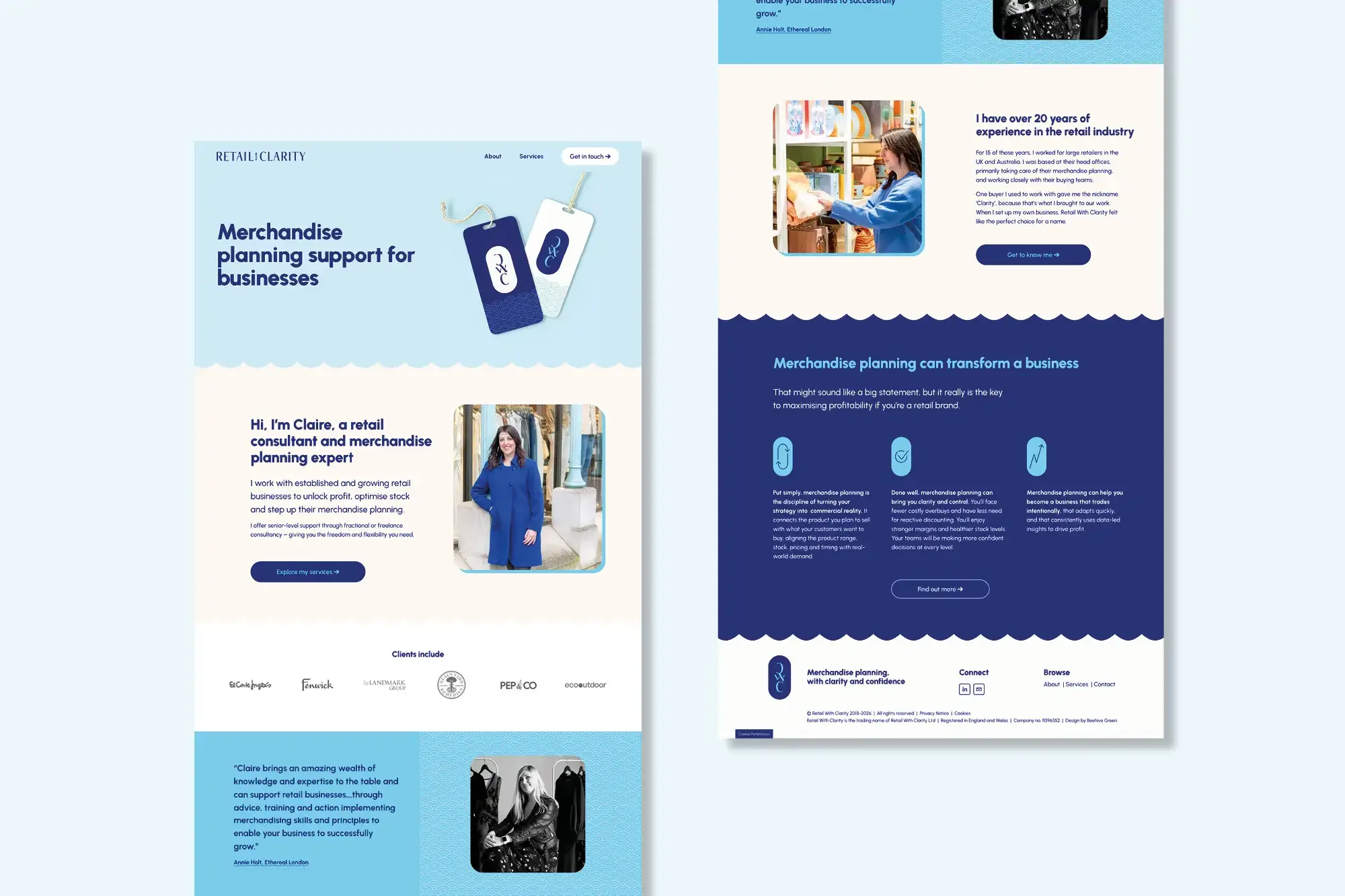
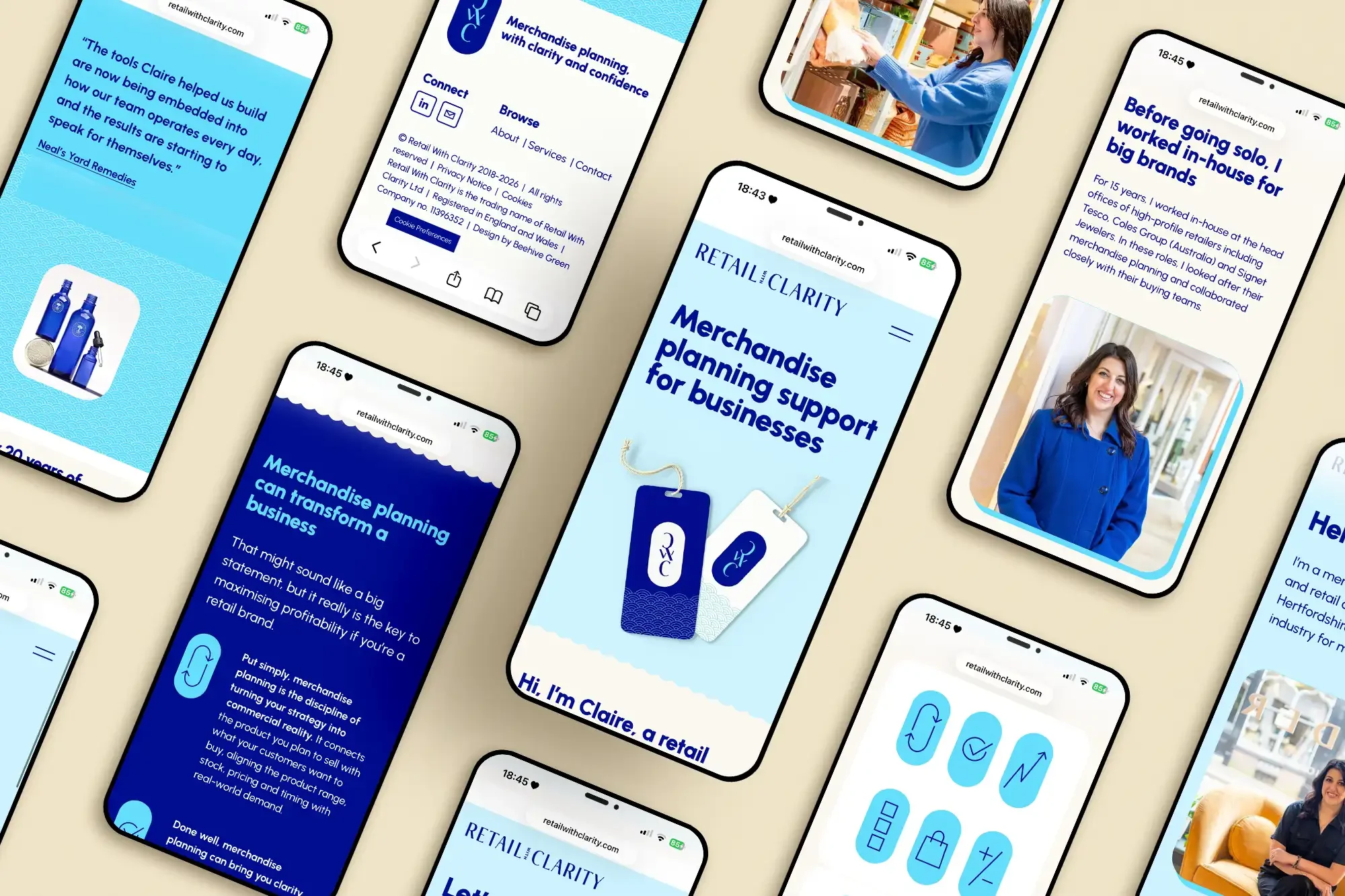
For the new website, I recommended Squarespace again. I find it’s the ideal web platform for small businesses, as it’s flexible, professional and easy to update in-house. I designed a lean, streamlined site with two main areas:
Service pages that guide retailers, from independents to established names, to the right support quickly
A knowledge hub that shares Claire’s expertise with people newer to retail, and builds trust before the first conversation
Copywriter Megan Rose brought the refreshed voice to life with direct, practical and warm words.
Client feedback
“Andrea’s ability to tap into your personal and brand values is superb and she invests time in truly understanding both your business and your customers. Her discipline in managing design projects ensured a very smooth process and kept me on track without feeling like I had a huge to-do list.”
— Claire Morris, Founder, Retail With Clarity
Brand impact – a long-standing partnership
Claire now has a brand that reflects how she works and who she works with: straight-talking, knowledgeable and approachable. Retailers can see what she offers and why it matters before they’ve picked up the phone.
Working with Claire from launch through to this refresh has been a real privilege. Eight years on, the clarity is the same, and now it speaks more directly.