
Coco
A bold statement identity for a Hertfordshire salon
Coco is a specialist nail and lash salon based in Welwyn Garden City and it’s been going strong since 2000. With a name inspired by the glamorous style icon Coco Chanel, the salon is sassy and fashion-conscious. Owner Nicola Barlow is fastidious about only working with premium quality products, partnering with and educating for Bio Sculpture and Lash Perfect.
Known for amazing nail art and an eye for the latest trends, Coco has a tribe of loyal clients who visit the salon to socialise as well as to enjoy beauty services. Thinking ahead to future-proof the brand, Nicola turned to Beehive Green for help to show the personality that makes Coco so special.
More +
Coco’s warm, welcoming approach sets it apart. To play on that, we decided their new identity should make a bold statement that stands out from the soft feminine or clinical approaches so often chosen by salons. It’s a classic and timeless look that matches the quality of Coco’s service.
The new logo has a minimal designer label feel, and the symbol contains the brand name within a circular design to create a distinctive icon alongside a simply styled wordmark. It’s no accident that the icon also resembles a fingerprint; it represents individuality and Coco’s friendly nature.
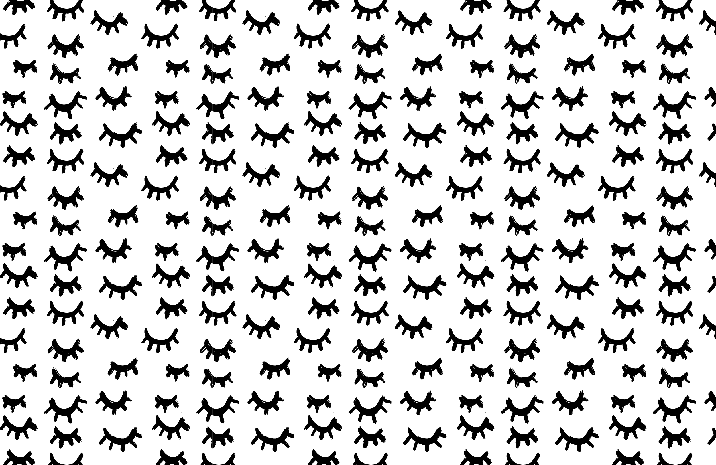
A minimal black and white colour palette, accented with a touch of grey and red, adds sophistication to the brand identity. Playful patterns inject that all-important personality, bringing vibrancy to the overall look alongside the refined typography. I developed a signature pattern to represent each salon service – lashes for lashes, circles for nails, and stripes for general use. From this design foundation, we created print and digital branding communications to evolve the Coco brand from top to bottom.
In a world of vast consumer choice, this sassy new look has elevated the Coco brand. It’s boosted the business, enabling Coco to raise its prices with confidence and reach more clients to help the brand grow.
Sectors
Beauty, wellbeing, lifestyle
Services
Brand identity
Print design
Digital design
Creative direction + design
Andrea Boughton
“Andrea focused on details that I hadn’t even considered. She was completely transparent about her process and always kept me involved. Everything we’d discussed was translated into beautiful branding that represents Coco perfectly. I’m over the moon with the results!”
— Nicola Barlow, Coco
