Hertfordshire Growth Hub
A brand built for growth
An accessible rebrand for Hertfordshire’s flagship public sector business support service.
The challenge
Running a business can feel hard to navigate. Hertfordshire Growth Hub makes it easier. It’s the county’s entry point to free, impartial business support, connecting SMEs with the advice, training and mentoring they need to start up or scale up.
As part of the national Growth Hub network, it needed to raise its profile both locally and nationally. The existing identity felt dated and lacked distinction, and the few assets it had were hard to use legibly across communications.
This rebrand was planned to address that, coinciding with a new digital platform and upcoming campaigns. I was invited to team up with parent brand Hertfordshire LEP (now Hertfordshire Futures) to lead on the visual identity, while their in-house communications team shaped positioning, tone of voice and content. The brief was to reposition Hertfordshire Growth Hub and deliver on its vision: to be the best Growth Hub in the country.
Project scope
• Logo and visual brand identity
• Digital templates
• Print design
Creative direction + brand design
Andrea Boughton
Logo and identity – growth you can see
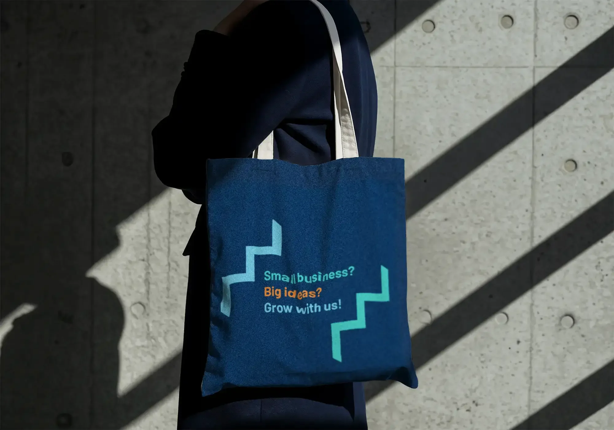
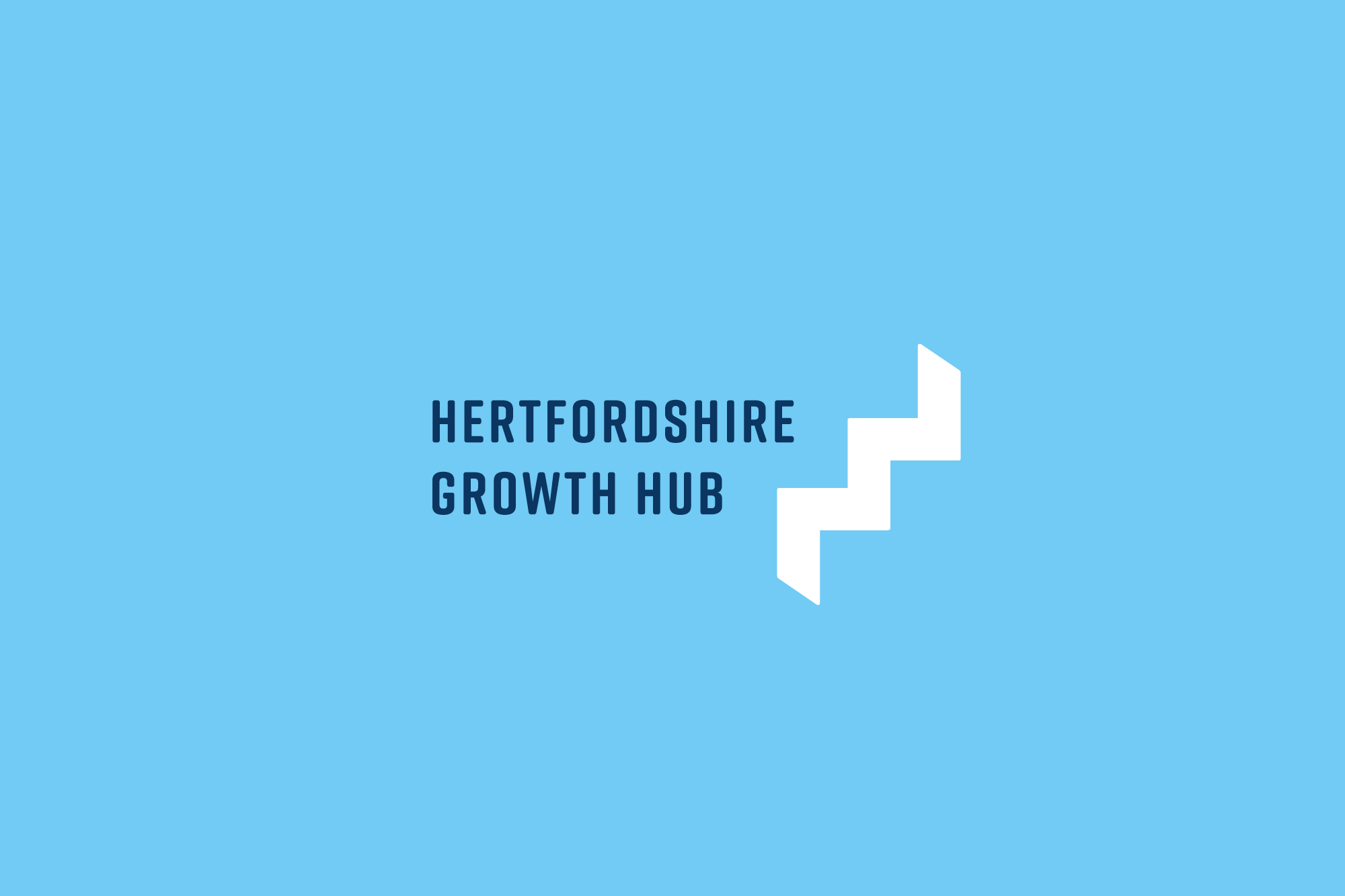
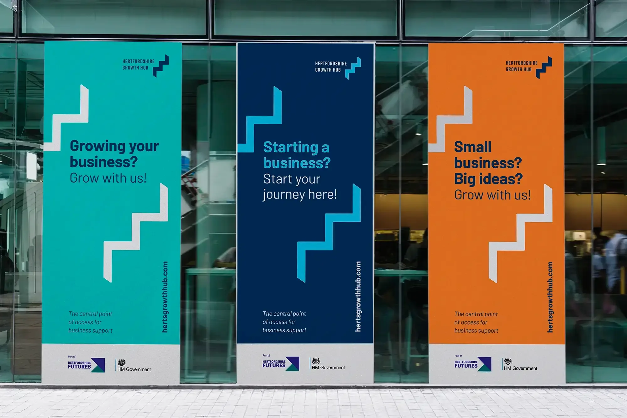
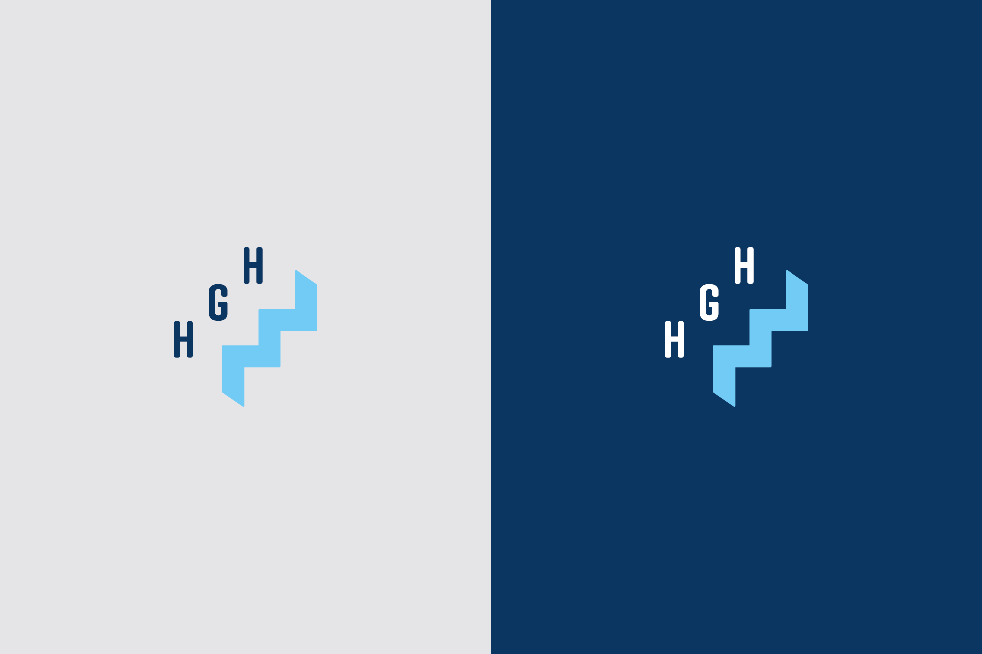
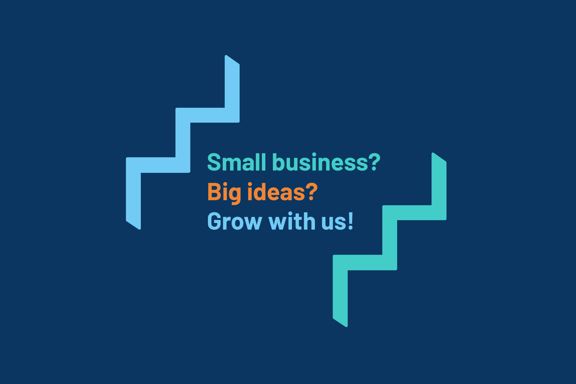
Growth sits at the heart of the new identity, symbolised by a steps icon in the logo. The icon also works as a standalone graphic, so the brand is quick to recognise wherever it shows up, and repetition builds brand awareness over time.
The wordmark balances approachable with authoritative. Rounded characters keep it friendly, and uppercase adds weight. Long names can be a challenge in logo design, so I used a condensed typeface to save space and keep it legible even at small sizes.
Accessibility is a core brand value, and it runs through every choice:
Colour: a reliable classic blue, lifted by bright teal, light blue and tangerine for energy, checked for WCAG 2.2 AA contrast.
Typeface: warm, legible and versatile, so it feels friendly and professional in equal measure. It’s open source, so it’s free for everyone to use without licensing costs.
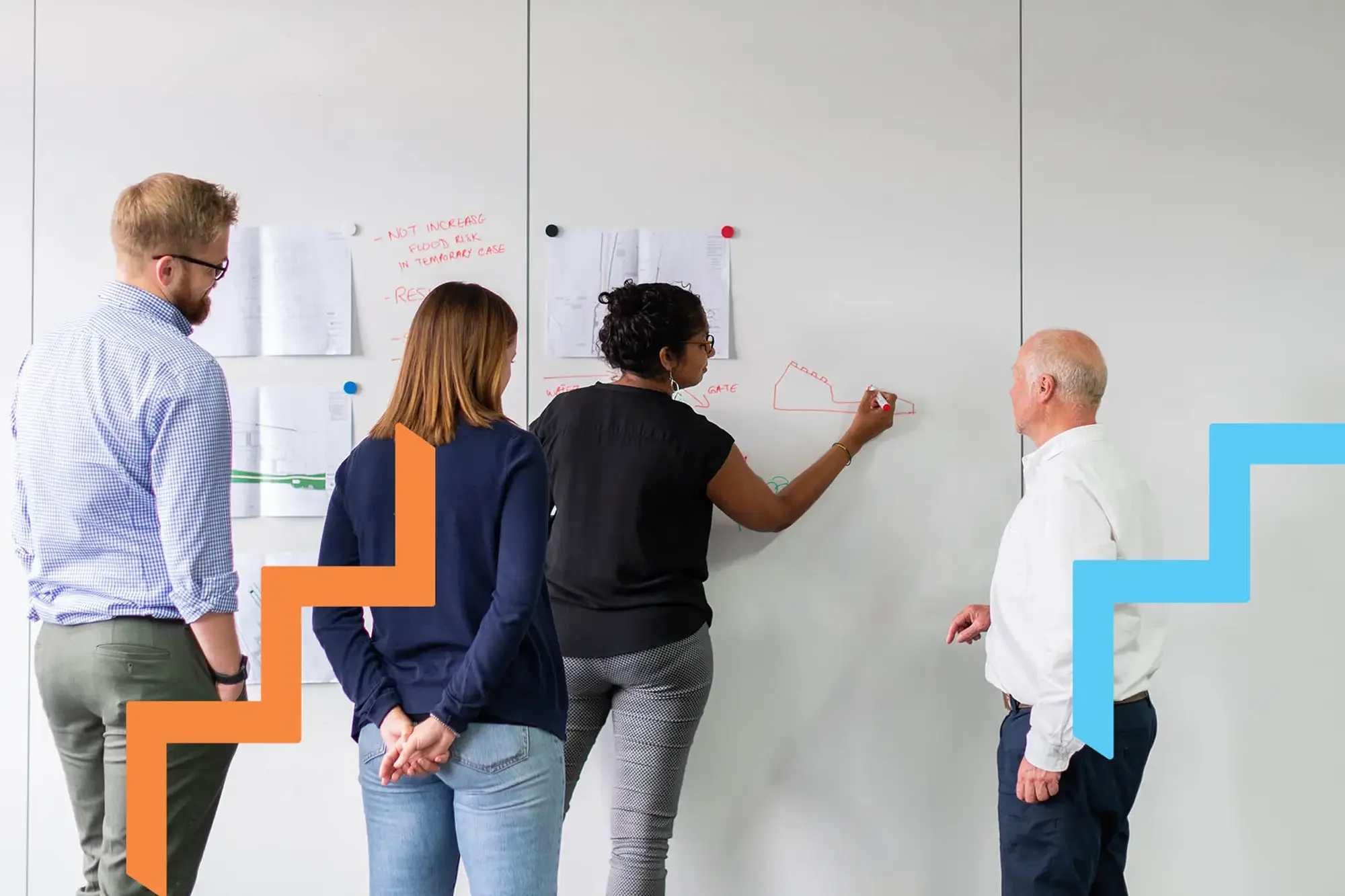
Photography: a natural style showing real people in relaxed settings, so the brand feels approachable and relatable.

Brand relationships – a clear hierarchy
This is usually where things start to feel crowded. Every communication needs to:
show the Growth Hub’s place in the brand family
acknowledge its funding partners
keep the Growth Hub brand front and centre
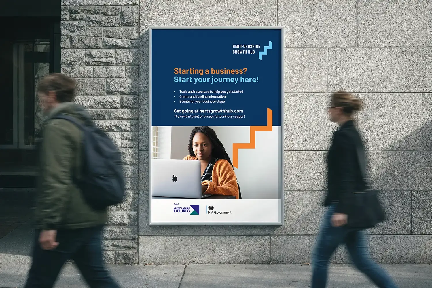
I went for simplicity, with a clear order that does the work:
the Growth Hub logo at the top
the ‘Part of Hertfordshire Futures’ logo lockup first in the footer
funding logos after it, in a single colour, so they don’t dominate
I set it all out in detailed brand guidelines, so the team have a clear system to apply.

Client feedback
“We have valued your individual input as so much time has been invested in curating and growing our brand family. This rebrand gives the Growth Hub much greater stand-out and visibility. The knowledge of our brand family is a huge asset for us, understanding how we wish to be seen and ensuring it reflects our corporate values.”
— Lucy Gravatt, Head of Communications, Hertfordshire Local Enterprise Partnership
Built to work in-house
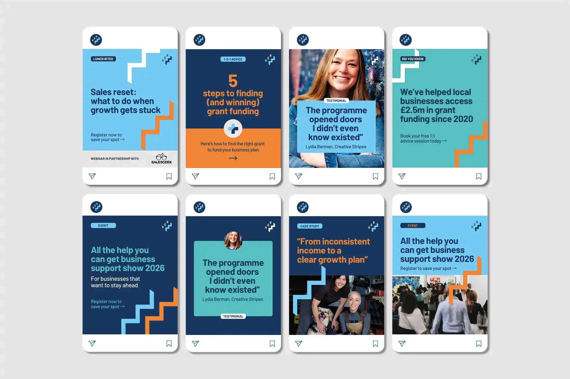
The Growth Hub’s in-house team look after its day-to-day design, so the identity had to be user-friendly. I created a suite of editable templates, from flyers and banners to presentation decks, alongside the brand guidelines. Now the team can create on-brand materials without starting from scratch.
Brand impact – and an ongoing partnership
The new identity gives Hertfordshire Growth Hub a confident, credible presence and a clear place in the county’s wider growth story. Between 2015 and 2025, it supported over 14,000 businesses, helped create and safeguard more than 2,800 jobs, and delivered 150+ workshops and webinars.
The brand system has stood the test of time, and our work together has carried on:
Workshop: I ran a workshop for Growth Hub businesses, sharing practical advice on making your brand accessible. [Watch my brand workshop here.
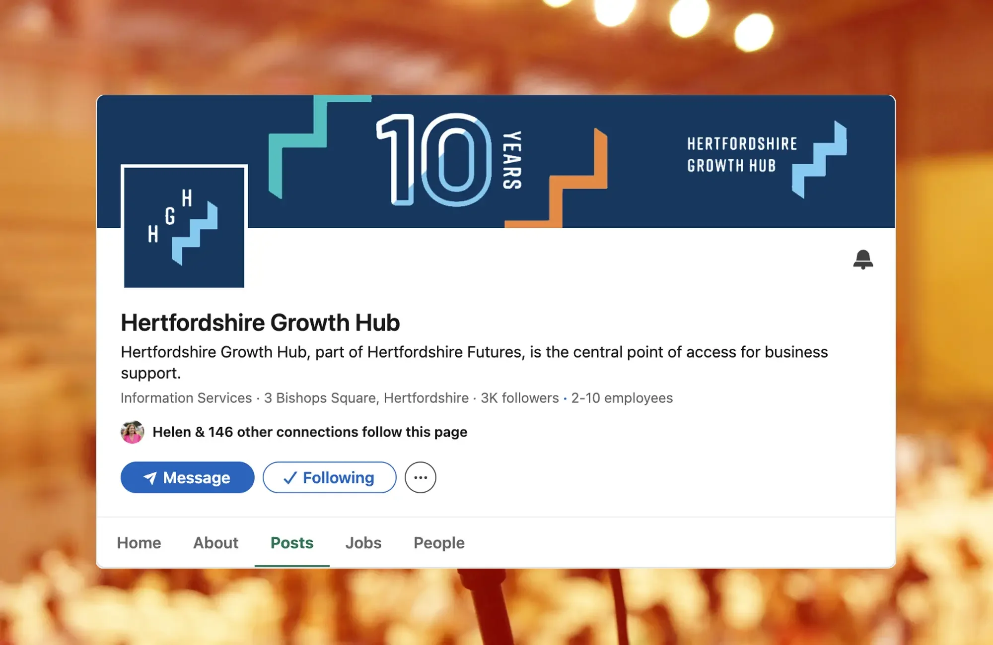
10th anniversary logo: designed last year to mark the milestone. A diagonal split of colour follows the angle of the steps icon, so it celebrates the occasion while staying unmistakably Growth Hub.
Brand guidelines update: the guidelines now include colour accessibility guidance, with contrast-tested colour combinations, so everything stays clear and readable.
Social media templates: a new set of editable templates means the team can create on-brand content in-house, quickly and consistently.
A brand that’s growing alongside the businesses it supports.