Hertfordshire Futures
Accelerating sustainable economic growth in Hertfordshire
Public sector branding that evolves with Hertfordshire Futures as it drives growth, innovation and opportunity across the county.

The challenge
Hertfordshire Futures sets the county’s economic strategy, aiming for it to be recognised as the UK’s innovation heartland by 2036.
It operates in an environment that rarely stands still. Government policy shifts, funding routes change, and priorities move. Founded as Hertfordshire Local Enterprise Partnership (LEP) in 2011, the organisation has grown rapidly, and its role in the county has become increasingly central. In 2024, it became fully integrated with Hertfordshire County Council and became Hertfordshire Futures.
This change puts real pressure on a public sector brand. It needs to carry authority with government and investors, while staying approachable for businesses and partners.
It also delivers services through a family of sub-brands, each with different audiences. The family relationship needs to be clear, so Hertfordshire Futures’ impact is visible. I’ve designed identities for several sub-brands, including Hertfordshire Growth Hub, Invest Hertfordshire and Hertfordshire Film Office.
Above all, the brand needs to stay recognisable and trusted. I’ve partnered with the organisation since 2015 to make sure it does.
Project scope
• Brand identity
• Brand guidelines
• Print and digital design
• Email marketing template
Evolving in stages
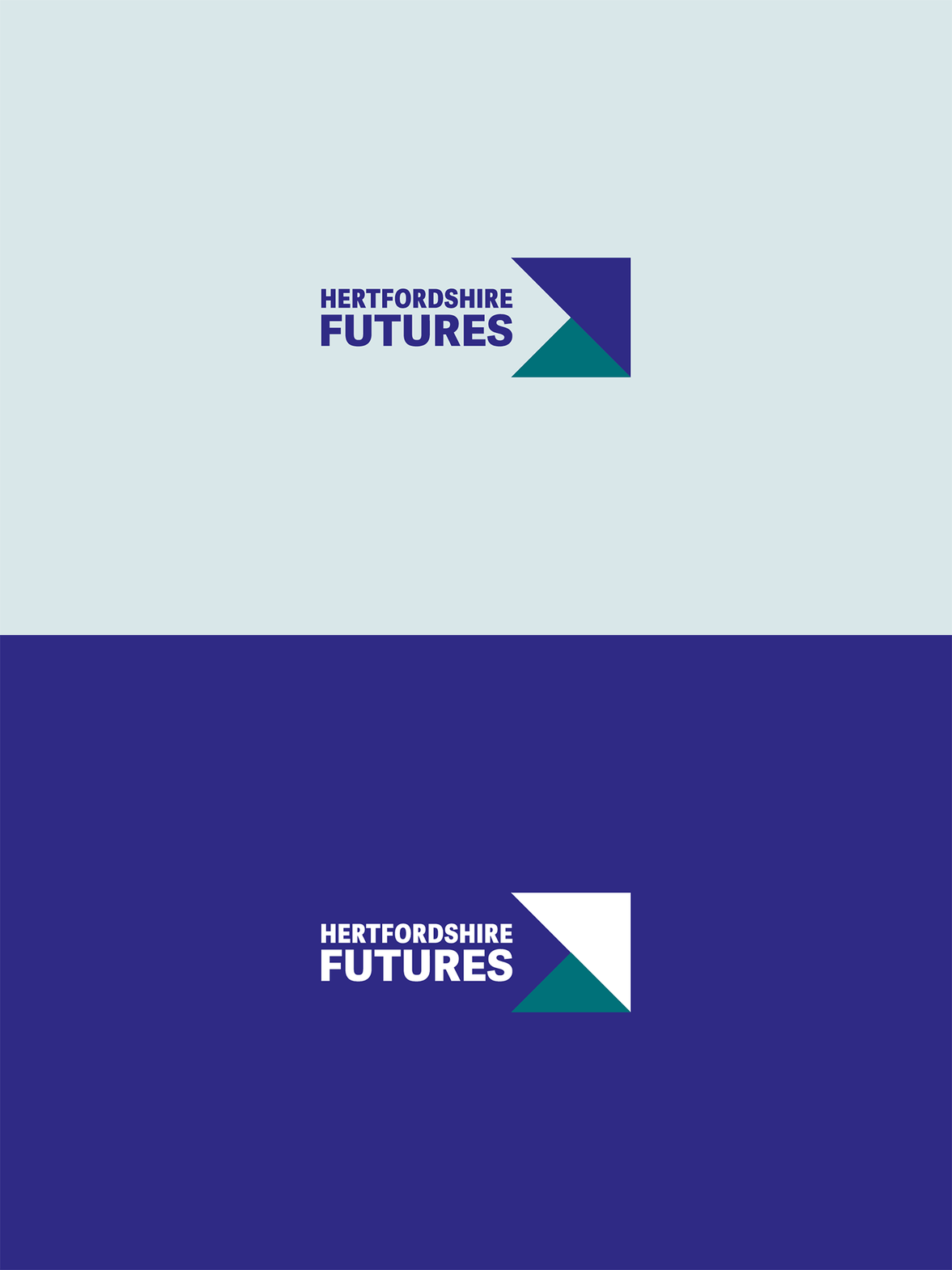
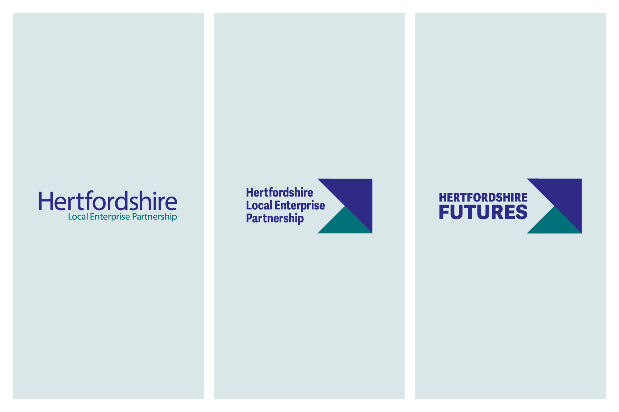
Like many organisations in their early days, the LEP created its original logo in-house. In 2016, I partnered with the comms team to build a visual identity around it. I developed an arrow graphic device, defined typography and confirmed a palette that supported the existing logo. I then used this toolkit to design templates, campaigns and reports, so the LEP’s communications looked and felt cohesive.
By 2020, rapid growth, changing priorities and a growing profile called for something bigger, so I led a complete brand refresh as creative director. The following year, I created anniversary branding to celebrate the LEP’s 10 years of delivery. Then in 2024, I updated the identity to reflect the new Hertfordshire Futures name.

Audit and strategy: recognising what works
The 2020 overhaul started with a brand audit. The organisation had already defined new brand values and voice, and the visual identity needed to communicate both credibility and its status. It also needed to be versatile enough to speak clearly to a diverse range of audiences.
The audit highlighted which elements had earned recognition and were worth keeping. Purple and teal had become synonymous with the organisation, so I deliberately stripped back the palette to focus on these two colours and make the brand instantly recognisable. For versatility, I added a set of tints with clear rules for using colour. The arrow device, symbolising partnership, progression and growth, had become a distinctive asset too, so it became the heart of the identity.

Building on distinctive assets
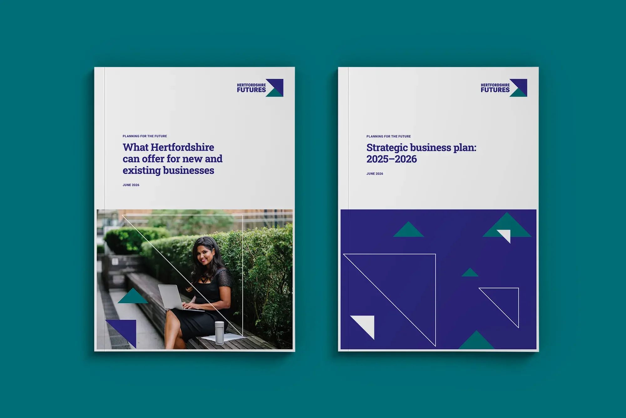
As the organisation grew, the logo wasn’t performing as well as it needed to, and it was tricky to apply in practice. So I designed a new logo that brings the familiar arrow device into the marque. It is distinctive, easy to apply legibly, and it builds trust through continuity.
The arrow also became a flexible graphic device and the basis of an icon library, which aids recognition and makes communications clearer. An upgraded typography system using open source fonts adds a confident, grown-up edge and a clear hierarchy, which also improves accessibility. Because the fonts are free to use, partners and suppliers can apply the brand easily, with no licensing costs.

Defining image direction
With such a broad remit, one image can rarely tell the full story, and this had been a pain point for the comms team. So I introduced two imagery styles that work on different levels:
Strategic imagery: textures and movement in the brand colours, introducing the brand at a high level
Context imagery: real Hertfordshire people, places and businesses, bringing funded projects to life
Client feedback
“Andrea is creative, friendly, approachable and gets the job done! The client/supplier relationship has been a key part of our success. We could procure an agency but we know that she spends a huge amount of time researching our organisation and that reaps dividends in the end result. If you could clone another Andrea, that would be helpful!”
— Lucy Gravatt, Head of Communications, Hertfordshire Local Enterprise Partnership
Brand guidelines built for public sector teams
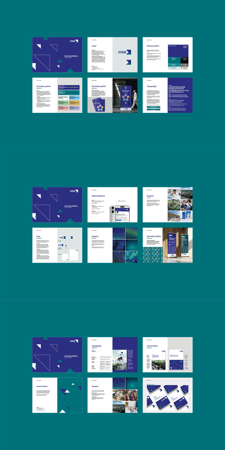
I created an in-depth brand book that shows how to apply every asset. It gives suppliers and partners clear rules for consistency, while leaving room for creativity. For services and sub-brands the organisation delivers, a new “Part of” logo lock-up and descriptor system highlights the brand family.
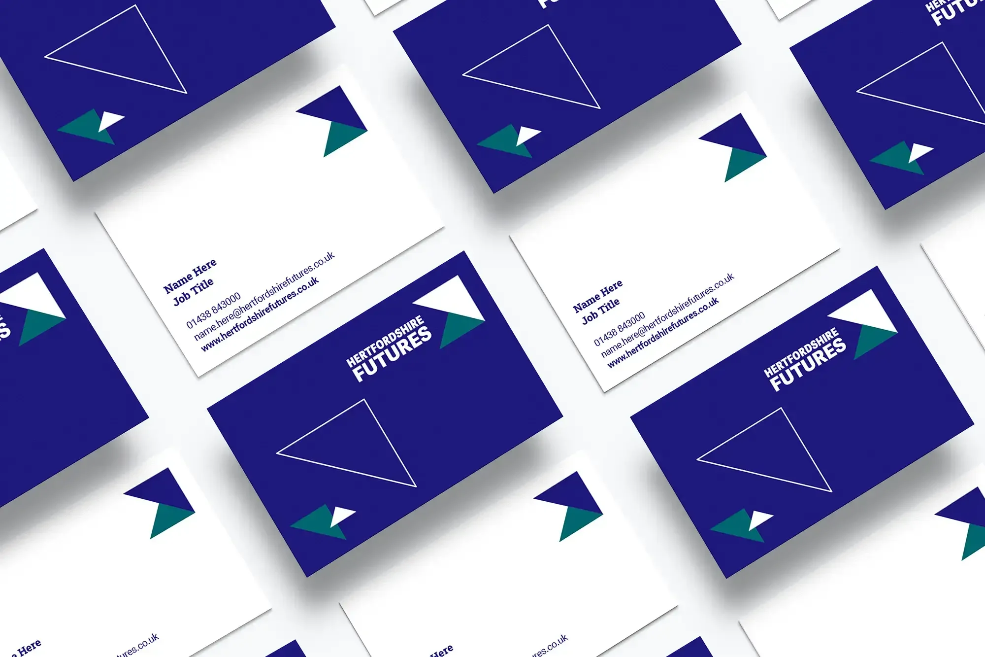
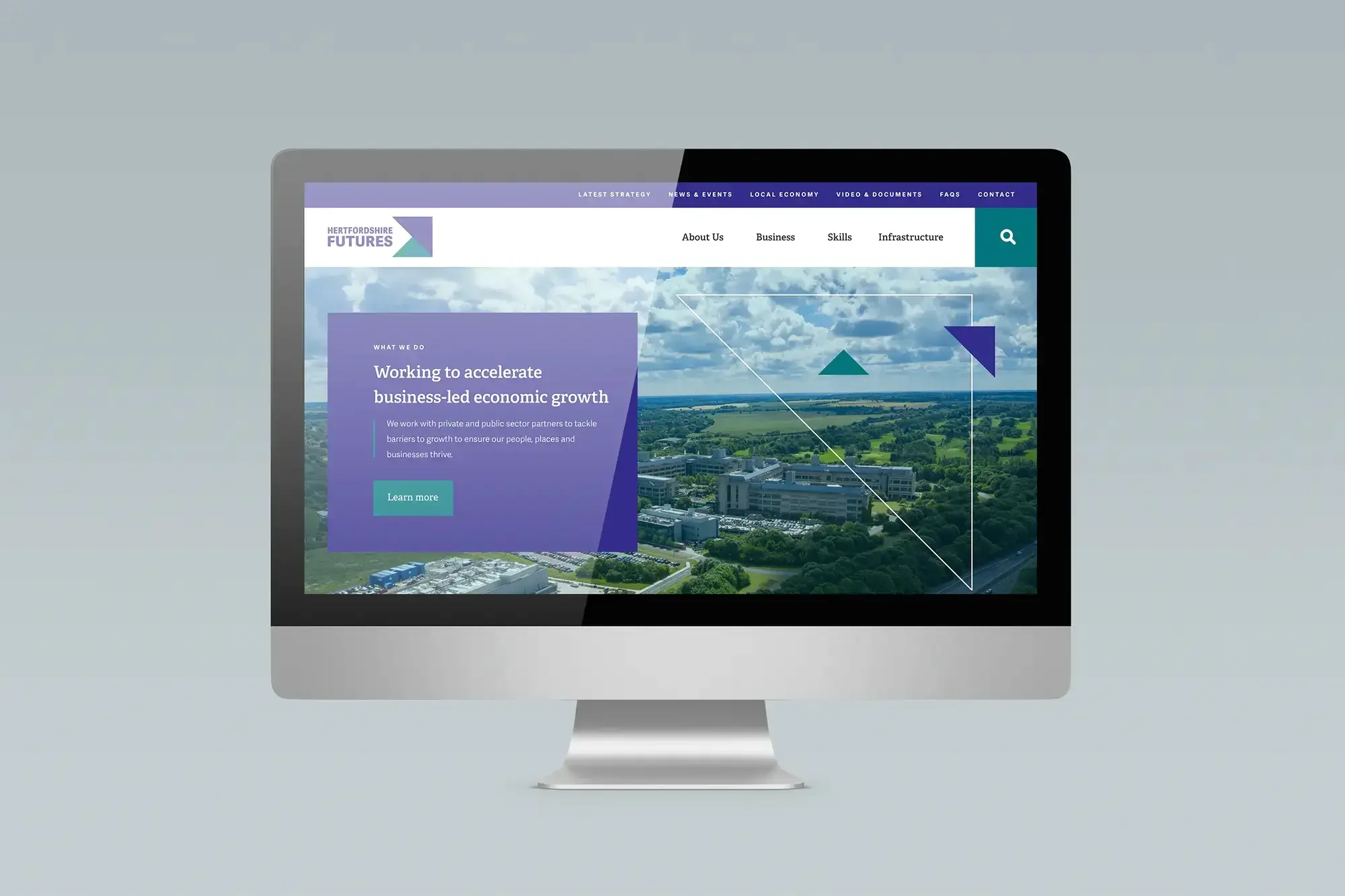
To complete the overhaul, I designed stationery and a suite of branded templates. These make on-brand communications quick and cost-effective to create in-house. In fact, the team no longer needs a designer for every white paper, presentation or social graphic. I also worked as brand guardian alongside the web design agency, so the identity carried through to the new website.
A new name, a familiar face
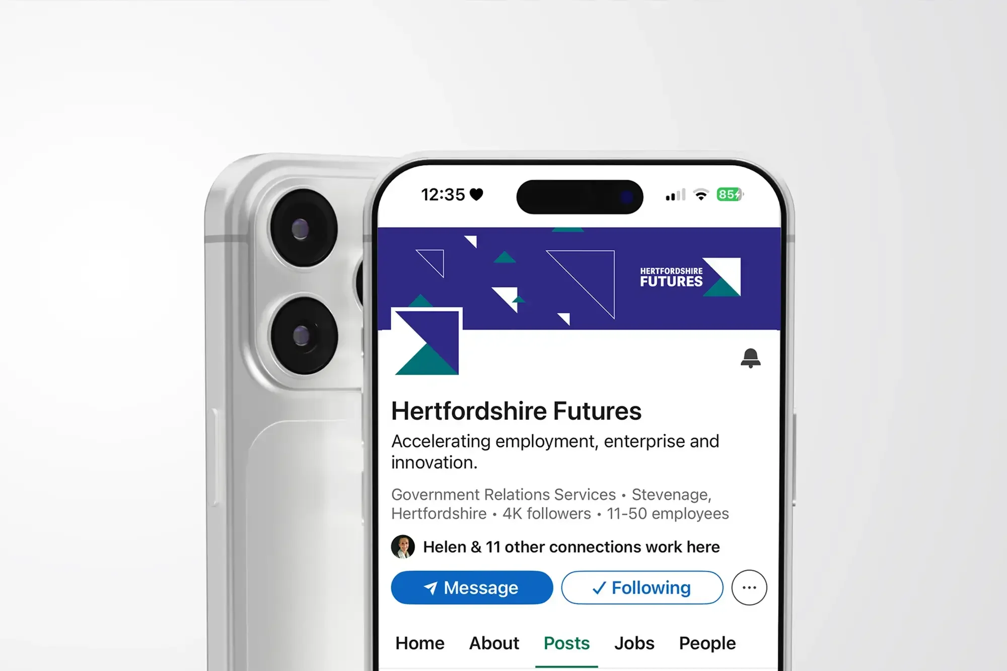
When the LEP became Hertfordshire Futures in 2024, the brand was well known and doing its job. So the look and feel stayed the same, and I simply redesigned the logo to carry the new name. This kept recognition high through the transition.
Good brands evolve and stay relevant, so in 2026 I’ve expanded the brand guidelines with accessibility best practices around colour pairings, as expected of a public sector organisation. This means every communication is clear and inclusive. I also introduced a secondary palette for new programmes like Digital Hertfordshire and the ESSV Social Values framework, giving them the flexibility to have their own distinct identity while staying clearly linked to the parent brand.
Ongoing brand impact
Continued investment in the brand has paid off. “The LEP has increased its profile hugely thanks, in part, to its directional branding,” says Lucy. And because the visual identity has evolved with a strategic focus, recognition has carried through every change, including a new name.
Our partnership continues, and most recently I designed Hertfordshire’s Economic Strategy 2026–2036, launched at Westminster this year.
This brand is designed to keep moving forward – and all these years on, the arrow still points in the right direction.