House of Colour
Creating a world-class brand perception
Rolling out a new visual brand identity with consistent graphic design to elevate brand recognition and strengthen brand awareness.

Project scope
• Brand implementation
• Print design
The challenge
For over 35 years, House of Colour’s image consultants have been providing colour and style analysis services that give people confidence and celebrate individuality.
While fashions and trends come and go, the theory of colour is based on science. Every person falls into one of four seasons that complements their natural colouring (I’m a spring). And psychology-based style analysis gives people the ability to mindfully embrace their personal style, avoid fads and shop sustainably. In other words, choose well, buy less, feel amazing.
Headed up in the UK, the global franchise now operates in the USA and beyond. And it’s growing rapidly. In 2021 House of Colour refreshed its brand to get a visual identity that aligned with its premium service. Without an in-house design team, House of Colour wanted support to activate their new brand toolkit. That’s where I came in.


Brand clarity
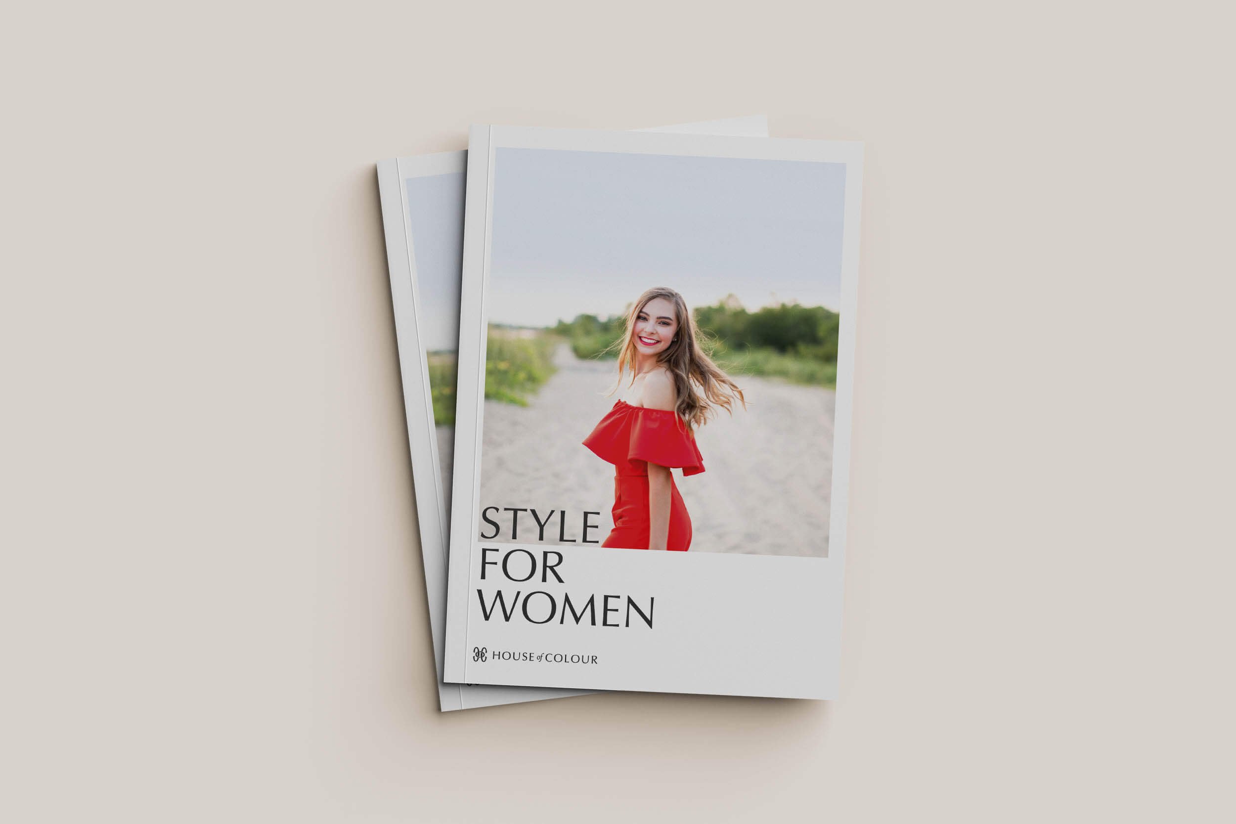
I was initially commissioned to redesign House of Colour’s style book, a brochure-come-workbook is used in style analysis sessions. It’s a high-quality keepsake that’s treasured as a long-lasting reference tool.
But there was a challenge. While House of Colour was delivered a beautiful new logo suite, typography and colours by its rebrand agency, it didn’t have fully developed brand guidelines in place or any design implemented to guide how the visual identity should be used.
To create the right brand perception, my first step was to dive into research. By understanding the thinking behind the refresh, I was able to work closely with the marketing team and create a high-end look that achieved the brand’s vision, using the newly defined visual toolkit.
Graphic language
Inspired by the brand strategy, I created a design with a fashion editorial tone that is both sophisticated and approachable. The look is effortlessly stylish, in keeping with the entire House of Colour experience.
I carefully crafted the graphic style with intelligent use of a neutral palette and clear space to appeal to all customers, regardless of their seasonal profile. Colour is introduced through photography, which evokes a sense of self-expression. A clean white background reflects the brand’s science-based approach. Typography is crisp and elegant, creating a clear hierarchy and authoritative tone.
As a core product, the style book design has since set the tone for all future communications.


Editorial photography
Colour is clearly at the heart of House of Colour and its photography plays a big role in bringing that to life. With a focus on people, it also makes the brand relatable and accessible.
It can be challenging to create a cohesive feel when images come from a variety of sources – the case here – but I overcame this by adopting a fashion mood board effect.
The juxtaposition of using everyday, user photography alongside professional photography is a practical way to showcase what it means to be happy, confident and stylish. This approach also celebrates the diversity of people House of Colour supports, while adding visual pace.


Branded touchpoints
Following on from the style book, I’ve continued working as a virtual in-house graphic designer to roll out the new visual identity consistently.
Other items include a pattern for protective tissue to package House of Colour’s cruelty free make up, customisable business cards for image consultants, a series of season-specific advanced colour books inspired by coffee table books and large format style boards for display in franchisee studios.
Consistent design across brand touchpoints enhances the high-end experience from start to finish, while thoughtful design prioritises accessibility and print sustainability.

Client feedback
“Andrea has always brought creativity, strategic direction and challenge to our work and we would totally recommend working with her.”
— Claire Bannister, Managing Director, House of Colour

Photo credit: Stephanie Belton and Sarah Biancardi
Colour fans
A personal highlight was designing House of Colour’s renowned seasonal colour fans. Tangible printed items extend the excitement beyond the initial consultation, creating a lasting brand experience. Each client receives a fan featuring fabric swatches from their designated season, to use on the go.
It felt appropriate to create a classic, timeless feel for the fans, so I explored a typographic concept that focuses on the seasons. The simple design uses just two colours and creates a consistent, distinctive look that unites the four fans.
The colour fan has since become a trademarked product, solidifying its integral role within the brand's identity.


Photo credit: House of Colour
A world-class brand
Our partnership has proven practical and effective for House of Colour. The trust and familiarity that comes from with the same graphic designer for multiple projects has streamlined the creative process. And the result is consistent, distinctive design that elevates brand recognition.
Margaret Harris, stylist and head of the advanced colour brochure project, endorses this, “Andrea is great to work with. She will suggest ideas and improvements, showing her thoughtfulness and understanding of the project in hand. She is a good communicator and listener too – really gets involved and wants the project to be perfect.”
House of Colour’s beautifully branded communications are now perfectly at home with its aspirational products and services. The graphic design creates impact, establishes how the new identity works and sets the bar for future communications.
I look forward to further collaborations and helping House of Colour continue to shine!
A big thank you to House of Colour, award-winning stylist Sarah Biancardi and brand photographer Stephanie Belton for their kind permission to use their photography.

