How do you stand out in a traditional industry without alienating a conservative audience? For Hertfordshire development consultancy Ellipsis, the answer started with three dots.
Ellipsis is a Hertfordshire-based residential development consultancy that specialises in project management and planning. Drawing on her vast housing sector experience, founder Stephanie Moffat launched the business in 2015. As a female-led business operating in a male-dominated industry, Stephanie blazes a trail for doing things differently.
The brief
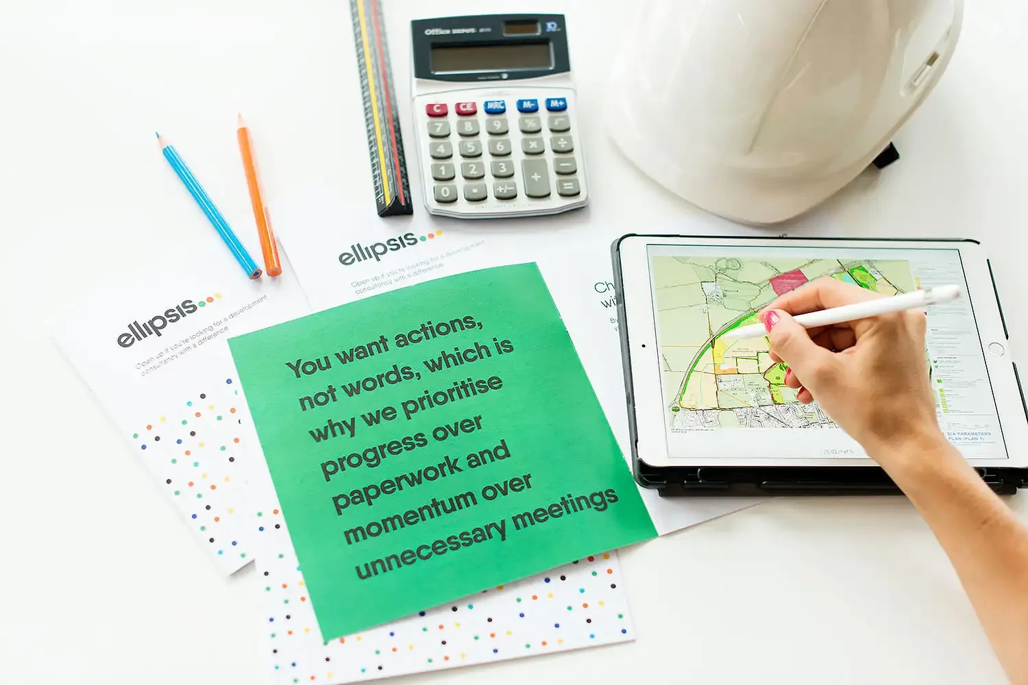
Ellipsis believes actions speak louder than words. With this driven attitude, it prides itself on prioritising progress over paperwork and delivering beyond expectations. Stephanie approached Beehive Green for an identity that shows the energy and passion Ellipsis brings to its work.
After commissioning several logos over the years – none of which ‘felt’ right – it was time to find the right brand personality and create an identity that goes beyond the logo.
Joining the dots
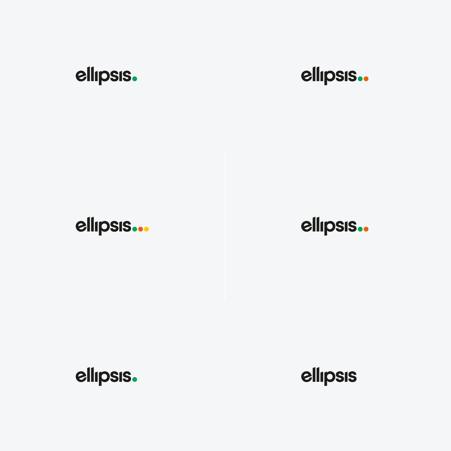
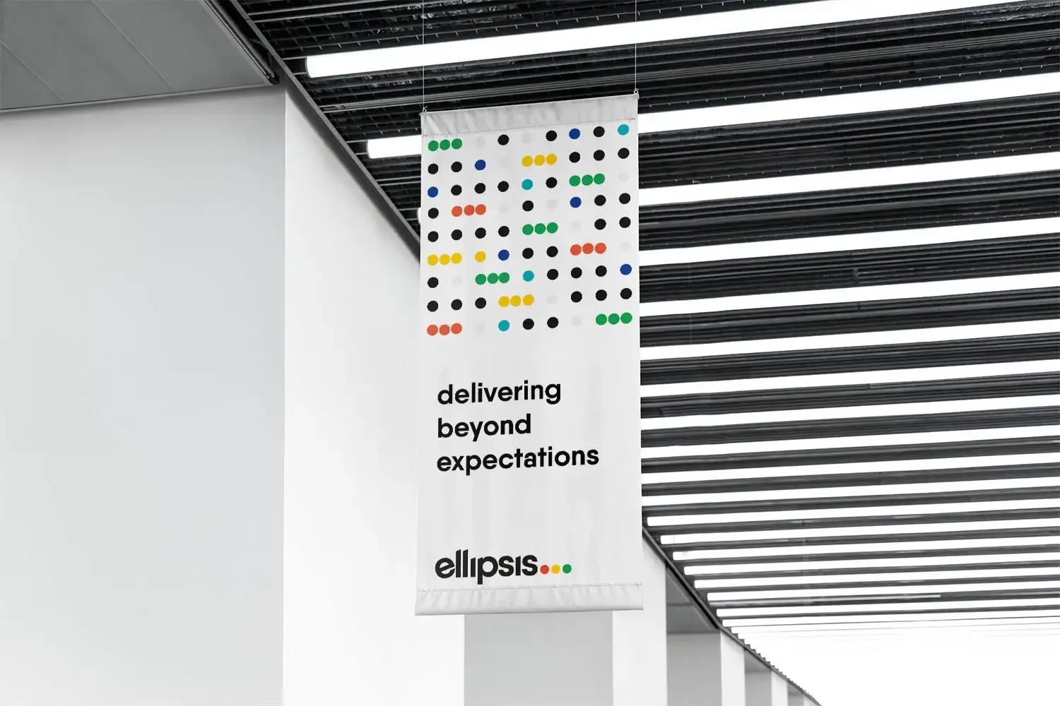
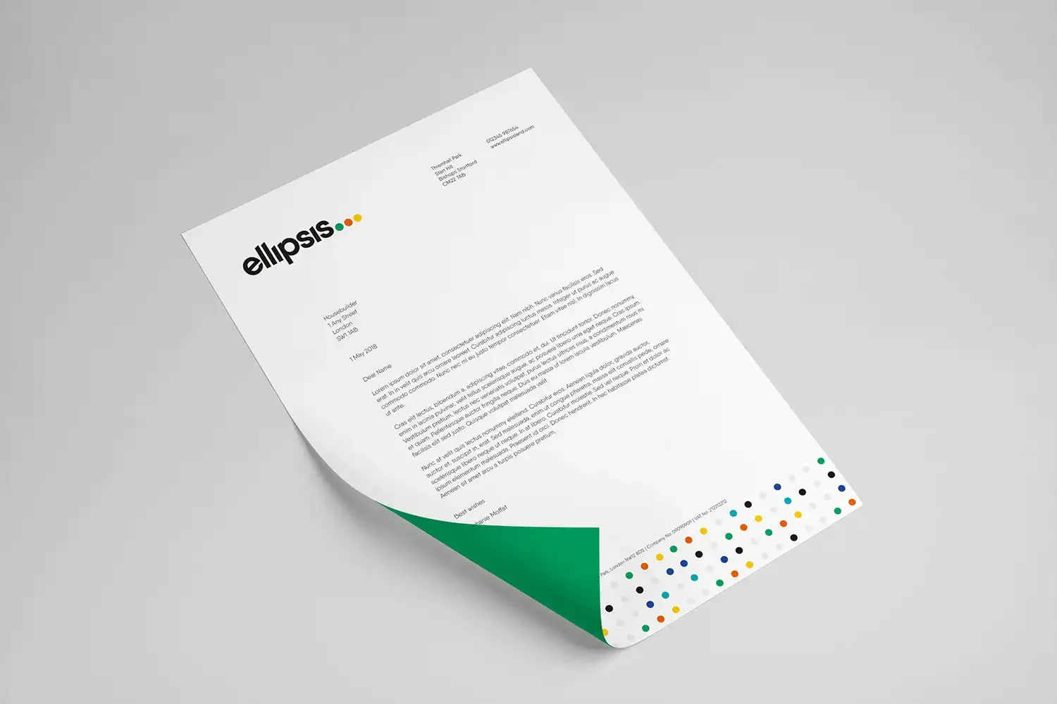
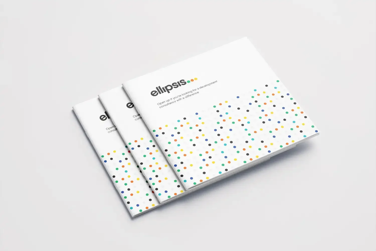
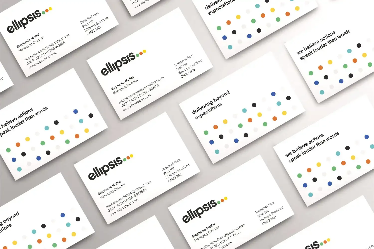
The ellipsis punctuation mark (…) adds dramatic effect to writing. This, together with the dots that make it up, is a key influence on the new visuals celebrated by the logo. The entire identity is united through the consistent use of circular graphics. A geometric ‘joining the dots’ pattern shows momentum and connection, while simple, bold typography aligns with the way Ellipsis works.
Colour with confidence
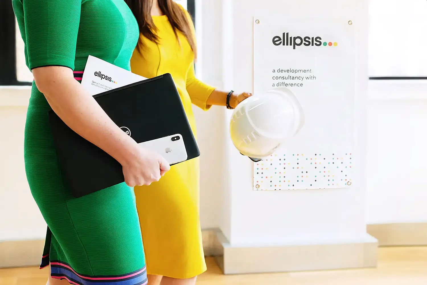
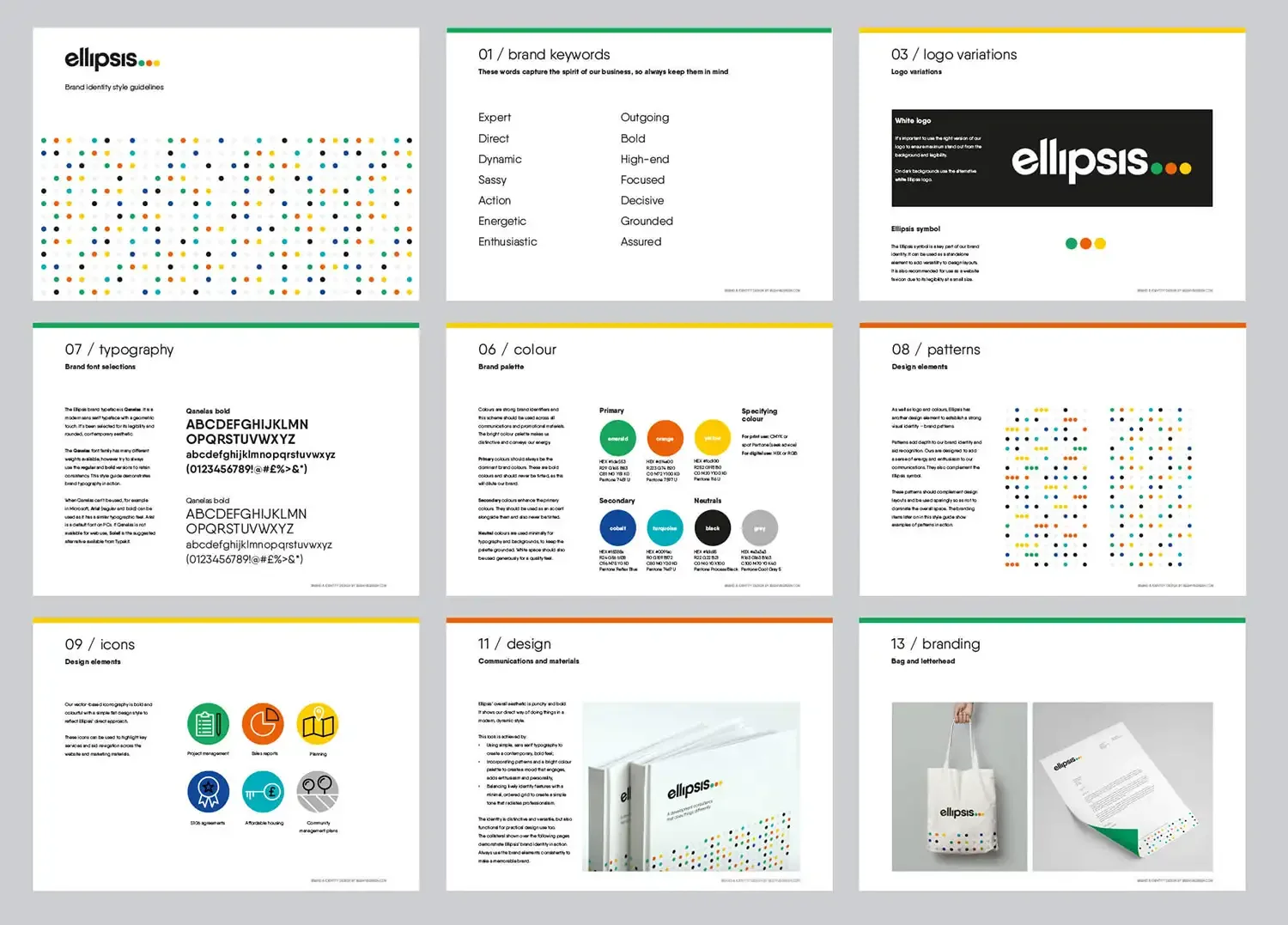
For mood, a bright colour palette – used selectively, so as not to alienate the company’s conservative audience – adds energy and attitude. Neutral black and grey keep things grounded, and the vibrant identity features are balanced out with a clean design style and ordered grid system that radiate professionalism.
“Thank you so much for all your work on the re-brand. I love the strategy behind it! It’s all spot on. Every time I see the dots, it makes me smile.”
— Steph Moffat, Managing Director, Ellipsis

Brand impact – the result
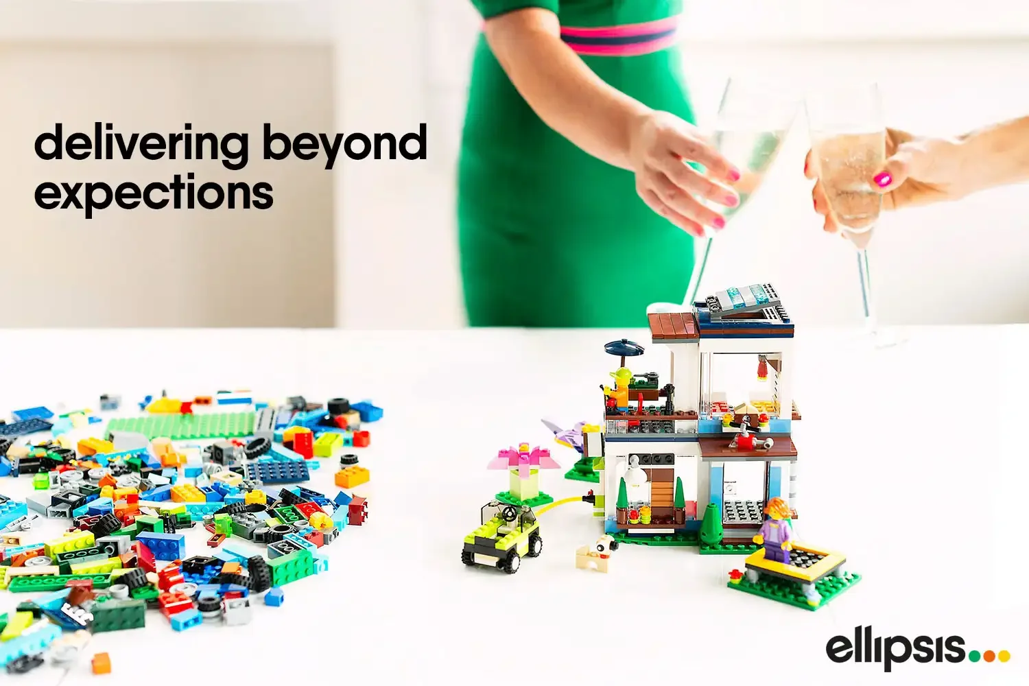
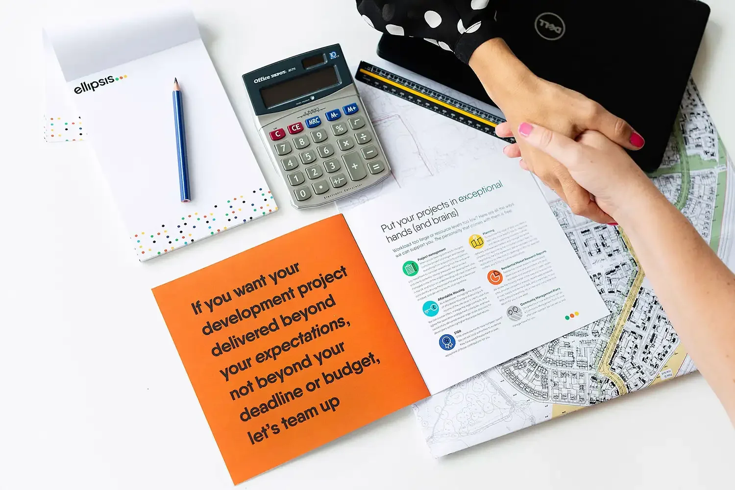
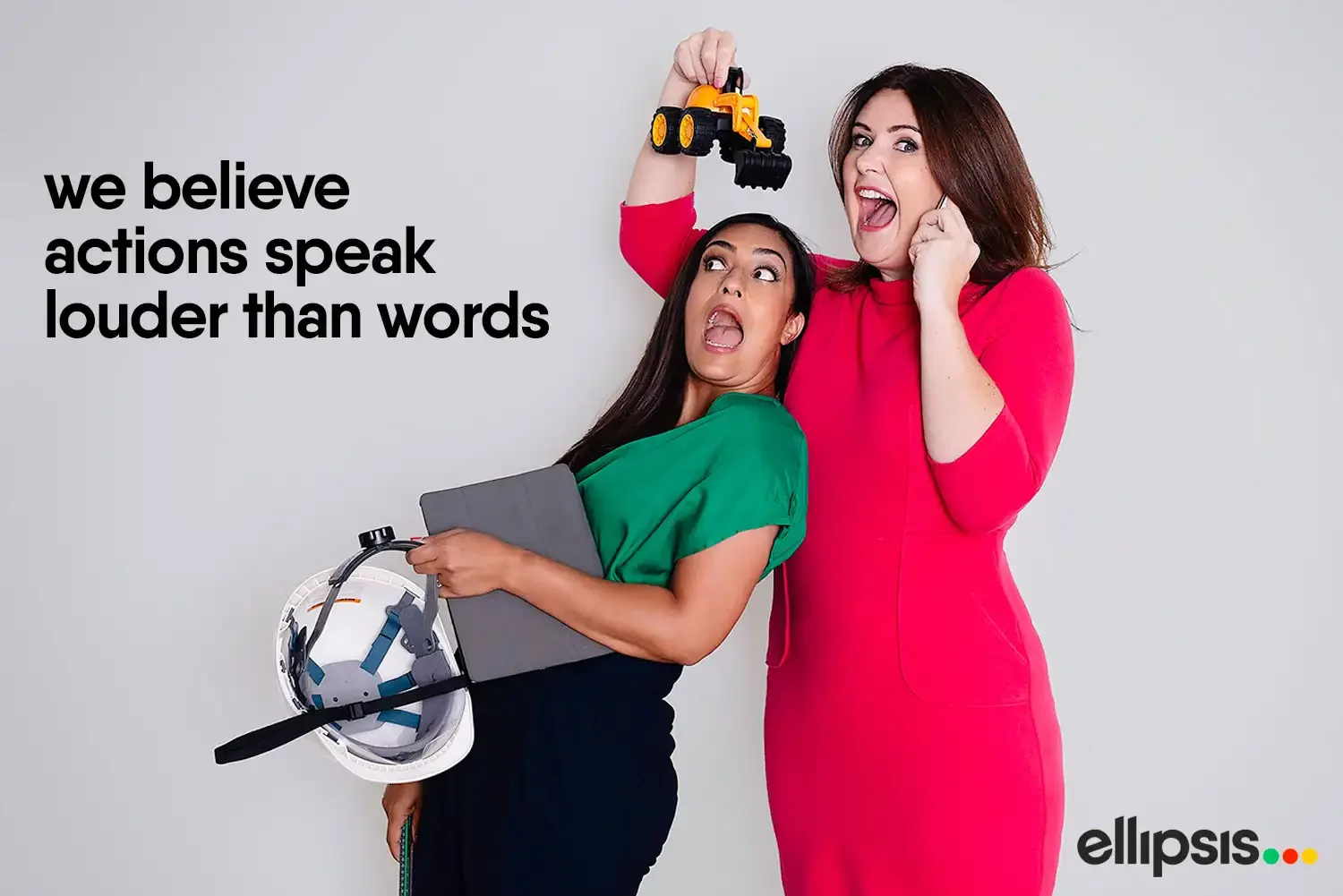
Ellipsis means business; it’s a dynamic consultancy. Now it looks the part, too, with its punchy and bold new brand aesthetic. Most importantly, this look will stand the test of time. The identity has been used to build cohesive communication materials, enhanced by strong photography that adds real character.
Do you need a brand identity that reflects your personality?
If you have a design project you’d like to chat about, I’d love to hear from you. Please get in touch.
