For Crimson Bee, the hexagon became the heart of a bold identity built for the video games industry and beyond.
Crimson Bee is a startup digital consultancy founded by strategist Sarah Seaby. With a people-led approach, she brings a human touch to help businesses develop teams, adapt to digital models and find new opportunities to grow. Sarah is a specialist in the video games industry but also helps businesses in other sectors and women in tech get on the path to long term success.
The brief
Sarah’s existing logo didn’t reflect the value she brings to her clients. Without any other brand assets, she struggled to create any communications and needed a website to get her startup started. She came to Beehive Green for a thorough new visual identity and a smart website to communicate her brand story and digital niche, while appealing to multiple audiences.
Inspired by the hive
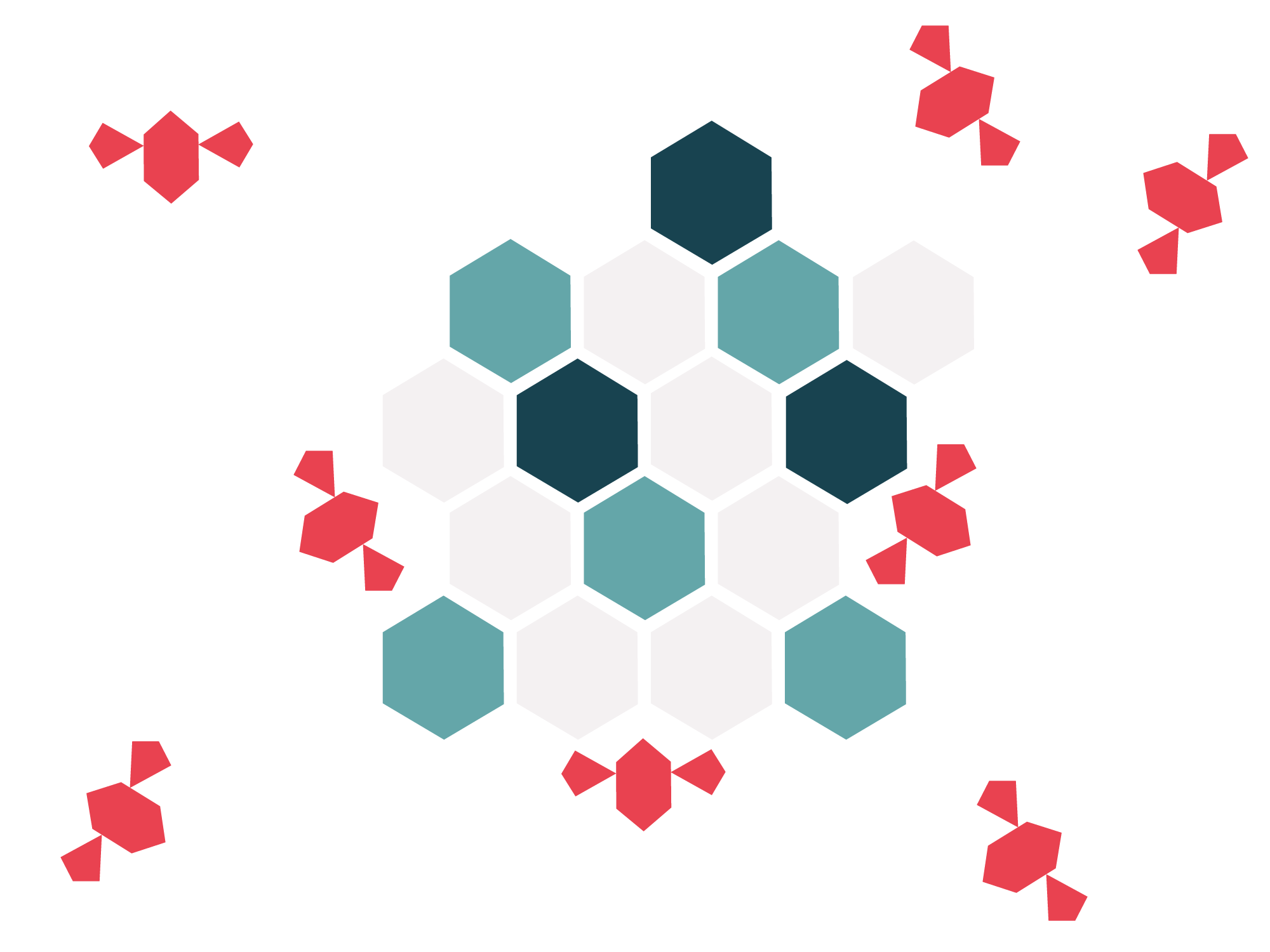
This project was a wonderful collaboration with brand strategist Lidia Rumley. Crimson Bee’s new identity was inspired by bee symbolism, which is woven through its story. The design concept centres on the hexagon shape. Geometry makes the hexagon the strongest, most useful shape for bees when they create their hives. The shape suggests efficiency – and that’s exactly what Sarah delivers to her clients.
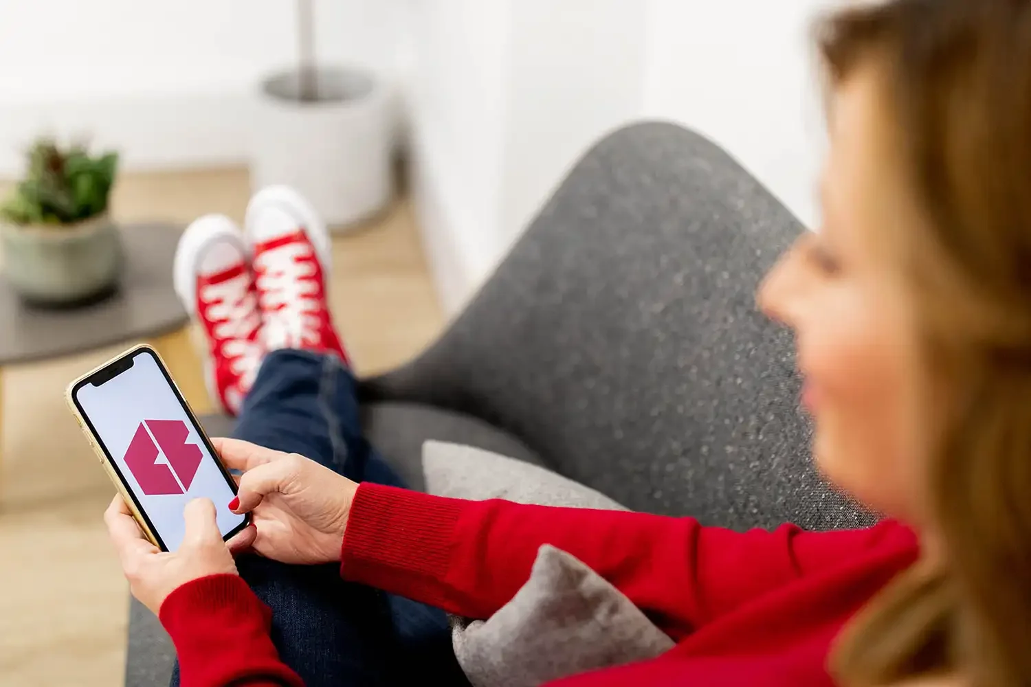
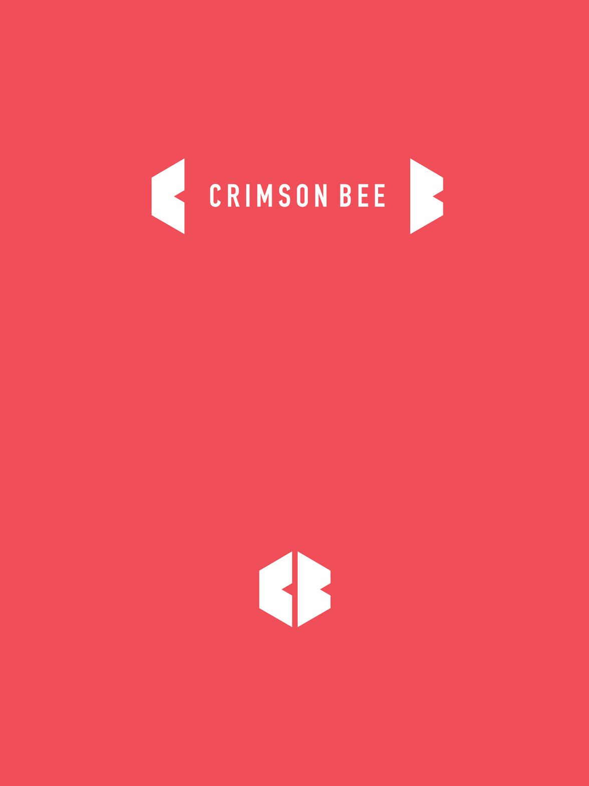
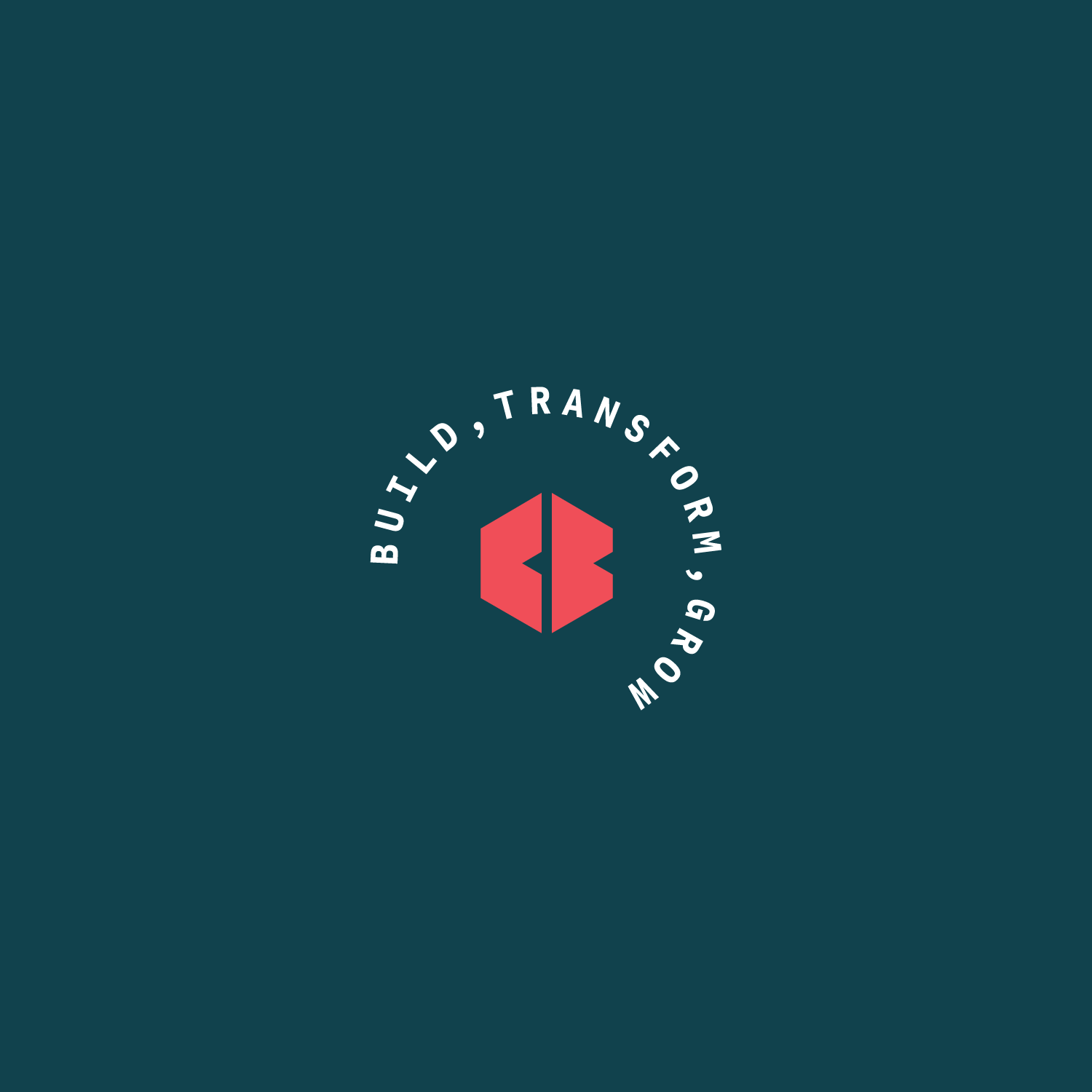
The new brand mark – a monogram of initials CB – forms a hexagon. It expands when set alongside the logo to become a ‘bracket’ framing device that’s reminiscent of coding in the digital world.
Bespoke brand illustration and distinctive colours
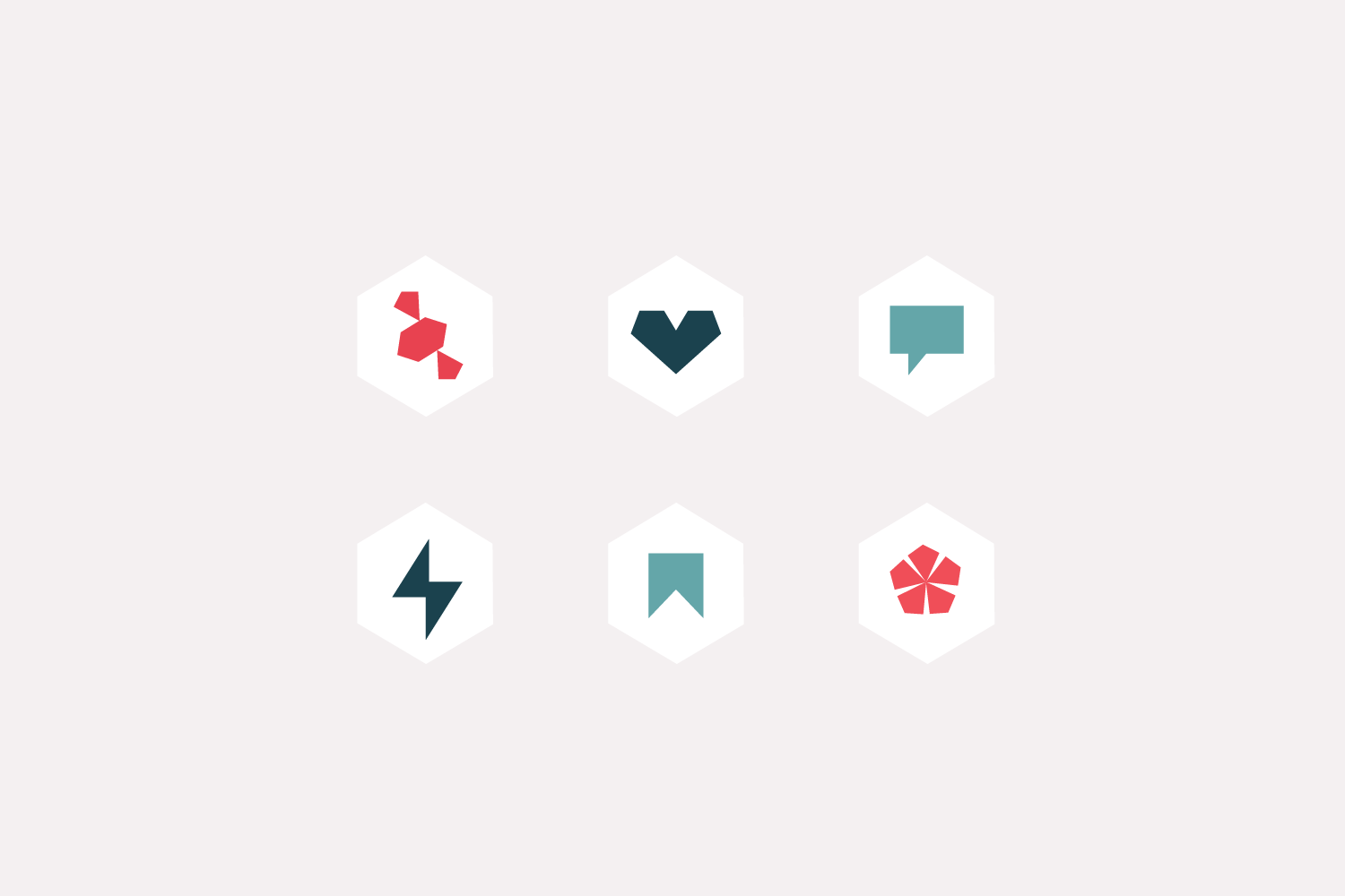
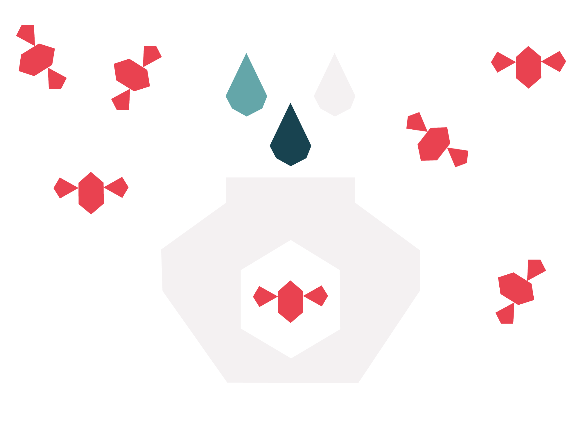
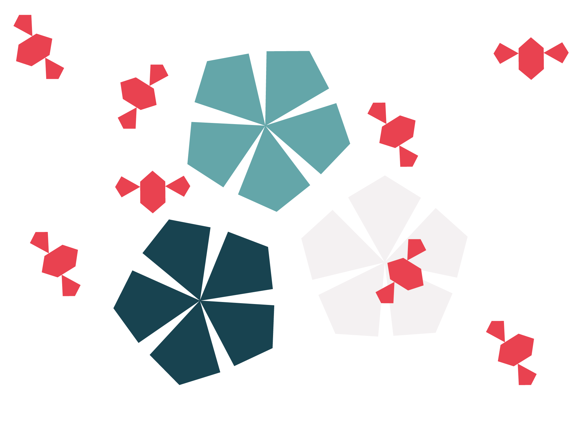
To aid with storytelling, I developed an illustrative style with clean, straight edges that clearly links to the logo. The recognisable style is carried through from icons and patterns to a series of illustrations. These visual elements add character and continuity across communications.
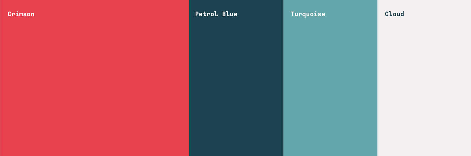
Crimson Bee’s approachable personality traits are reflected in its brand colours. The palette comprises crimson (of course!) which is warm and energetic, balanced by a petrol blue tone that conveys trust and intelligence, alongside turquoise that stands for clarity and creativity.
Client feedback
“From our first conversation, I knew Andrea was the right person for me, she understood my objectives, immersed herself into my brand story, and was easy to work with throughout the process. I am so very happy with the outcome.”
— Sarah Seaby, Crimson Bee
Typography and art direction
The look is tied together with a brand typographic system that has gravitas but also feels approachable. I included a cute monospaced ‘personality’ font to provide a digital edge.
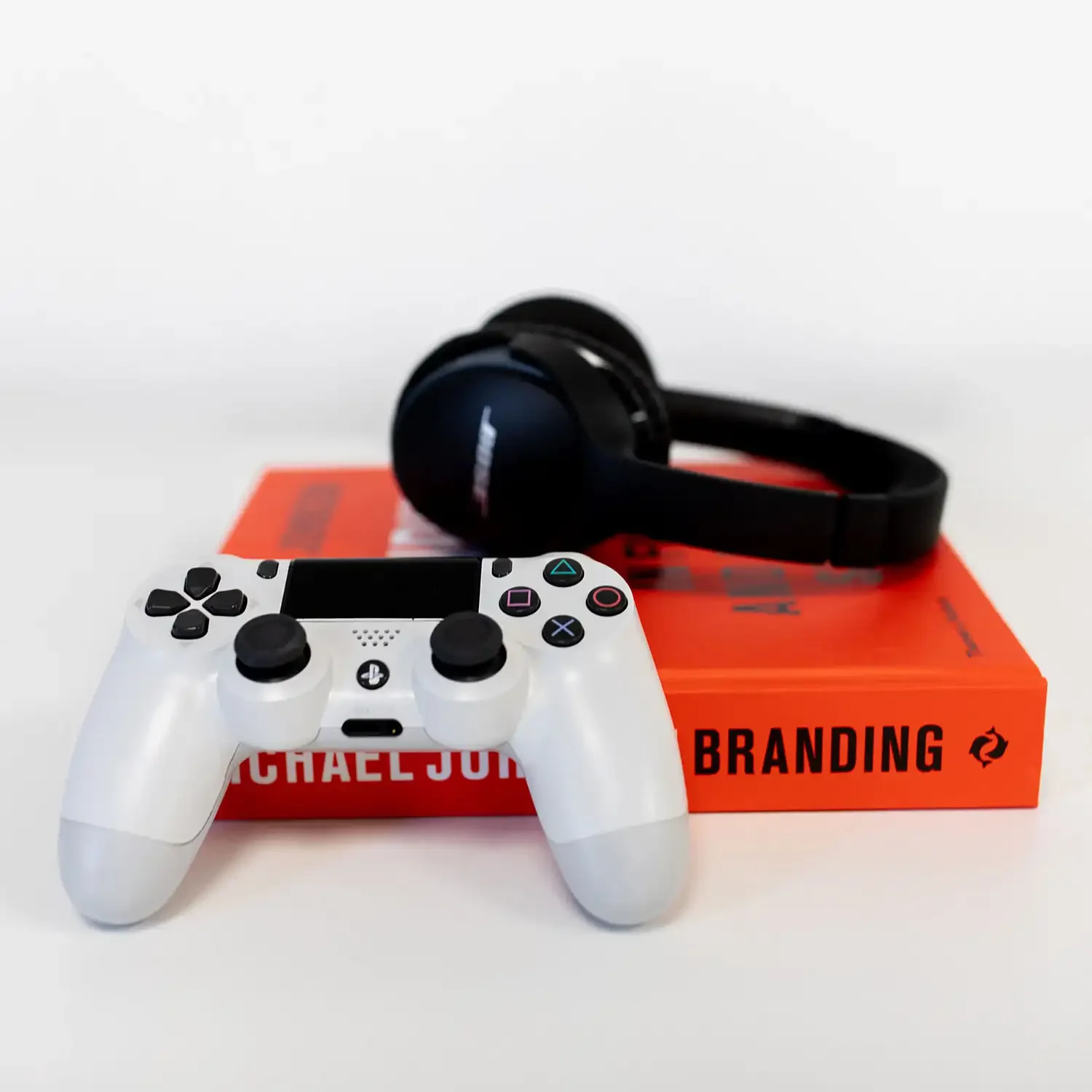
Photography was key; I art directed a photo shoot with brand photographer Stephanie O’Callaghan to create the right feel. Alongside founder portraits, I made sure the shoot included detail and prop shots, so Crimson Bee had a robust library of on-brand images ready for its website, social media and marketing, with pops of crimson throughout.

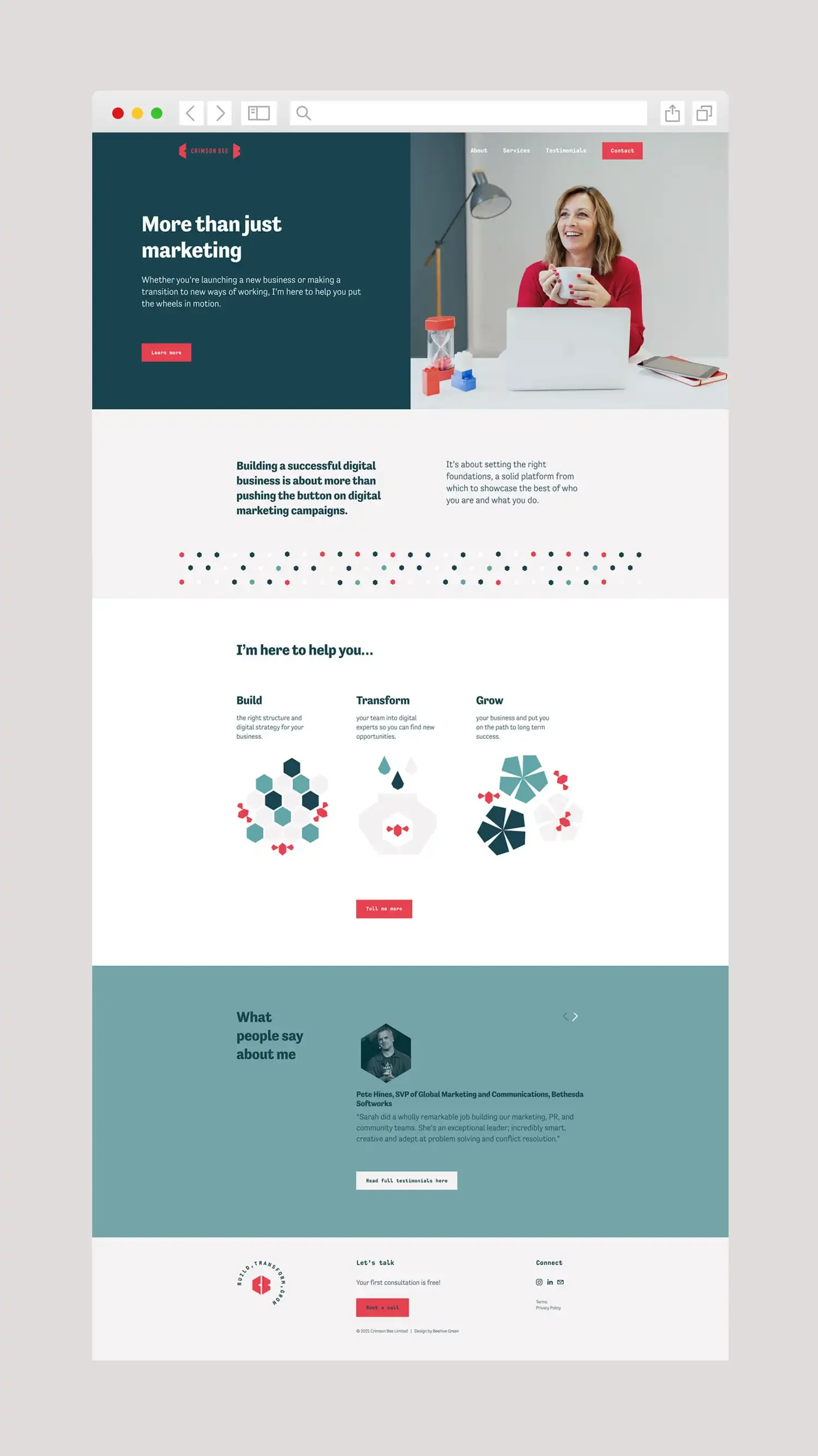
Squarespace website and brand guidelines
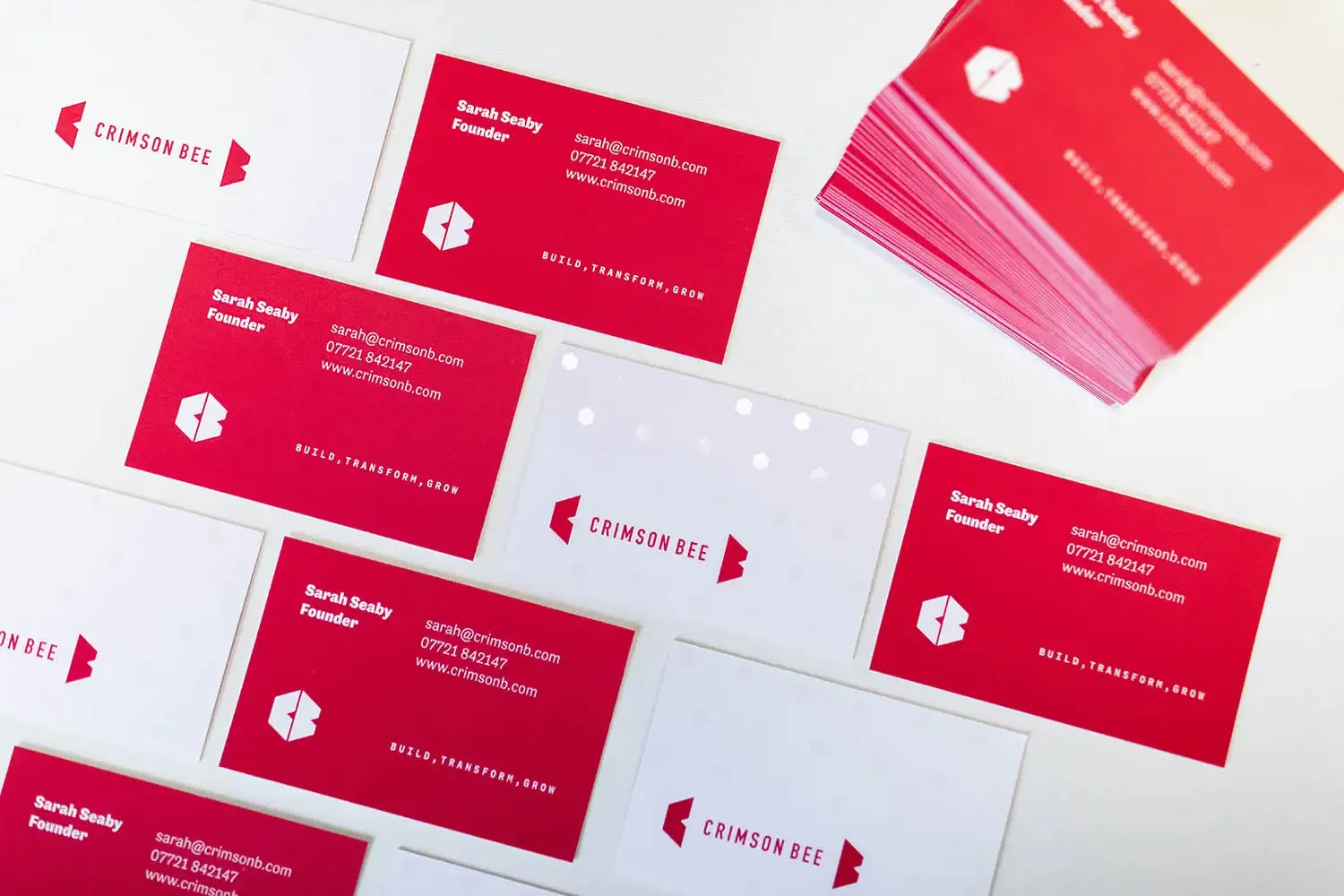
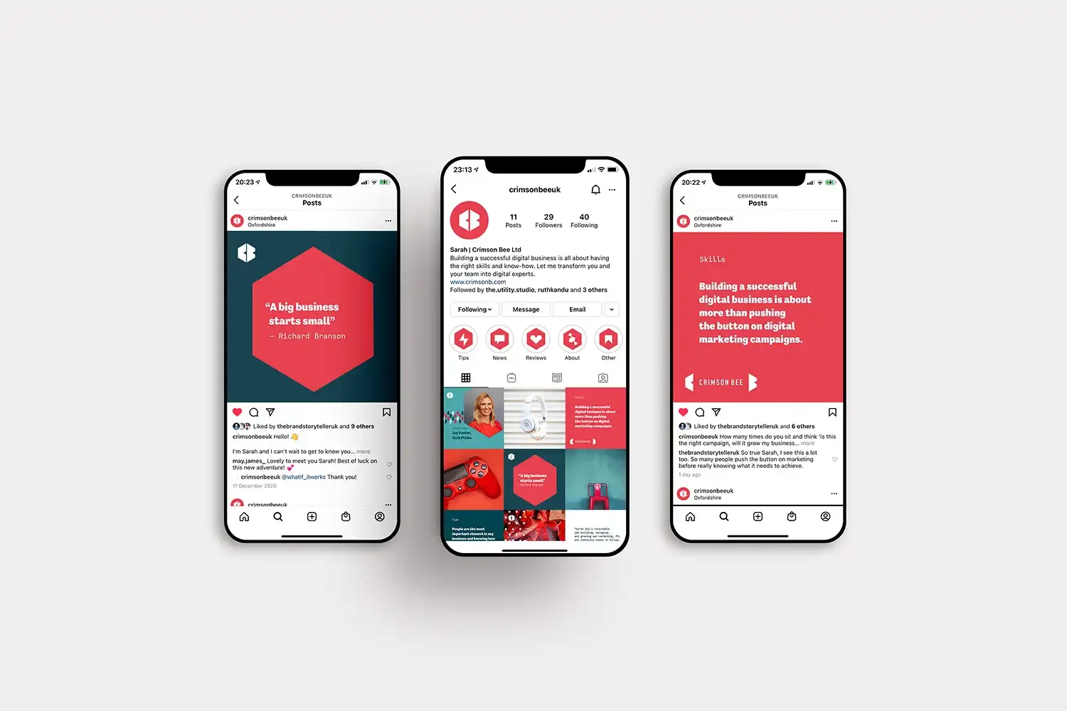
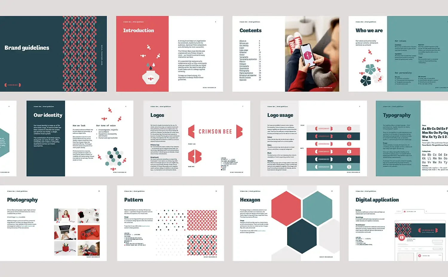
To complete the project, the identity was rolled out across an array of digital and print materials. I designed a distinctive Squarespace website to build brand awareness and created comprehensive brand guidelines to ensure ongoing consistency.
The result
The new bold and confident Crimson Bee aesthetic delivers a balance of credibility and creative energy, helping position it as the digital expert for the gaming sector and other audiences. It’s collaboration ready!
Do you need a brand identity that reflects your personality?
If you have a design project you’d like to chat about, I’d love to hear from you. Please get in touch.
