What does a brand look like for an internationally collected artist with a piece in the V&A? For Angela Jarman, the answer was simple: personal, one-of-a-kind, and signed in her own hand.
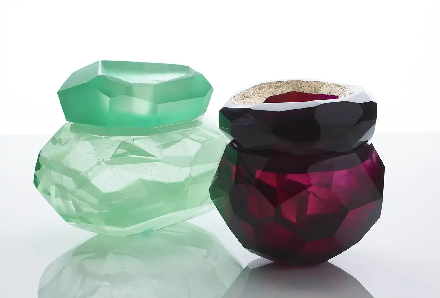
Angela Jarman’s beautiful art is inspired by natural forms and her pieces are one of a kind. Based in Hertfordshire, she exhibits internationally and features in museum collections worldwide, including London’s Victoria & Albert Museum. Angela’s work is sought after for its unique style and for the expertise she’s gained over her 20-year career, and she partners with premium London gallery Adrian Sassoon to sell her work.
The creative brief
After teaching her specialised lost-wax glass casting technique across the UK for many years, Angela was inspired to invest in her brand as she launches an independent commercial venture to run workshops in her own studio. She also wanted a website she’d be proud to share, one that showcases both her collections and her expertise.
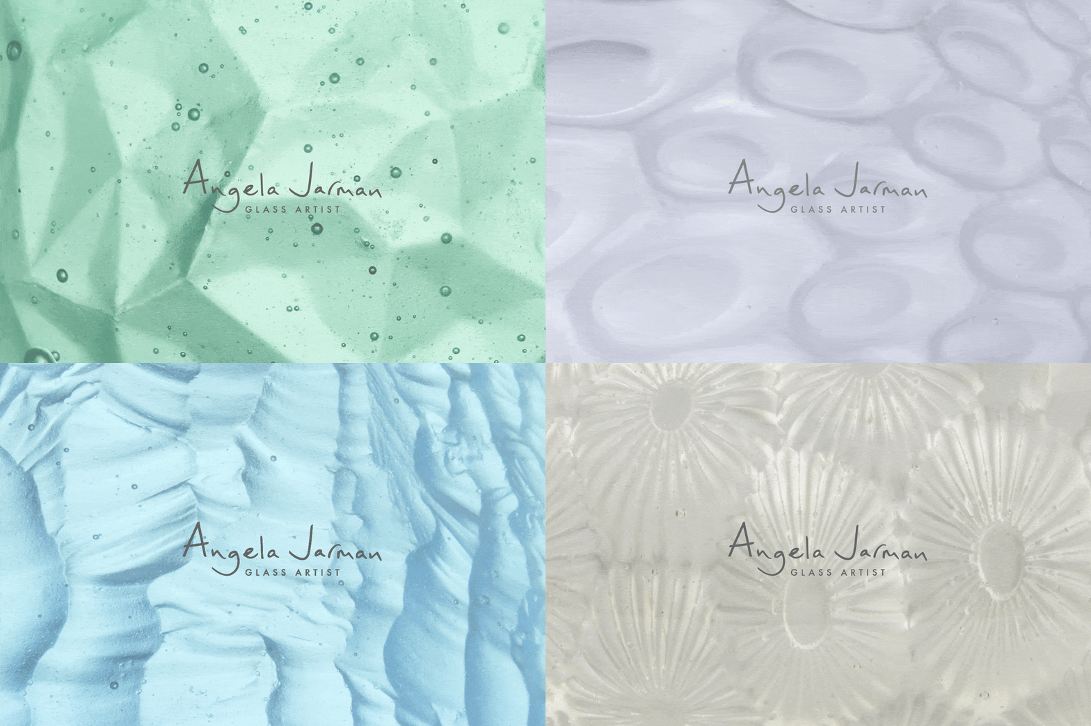
A backdrop for the work – type, colour and texture
Angela’s artwork is naturally the focus of her brand. The visual brand identity I designed is intentionally understated, choosing a minimal look – simple, neutral and ordered – to act as a backdrop to her work.
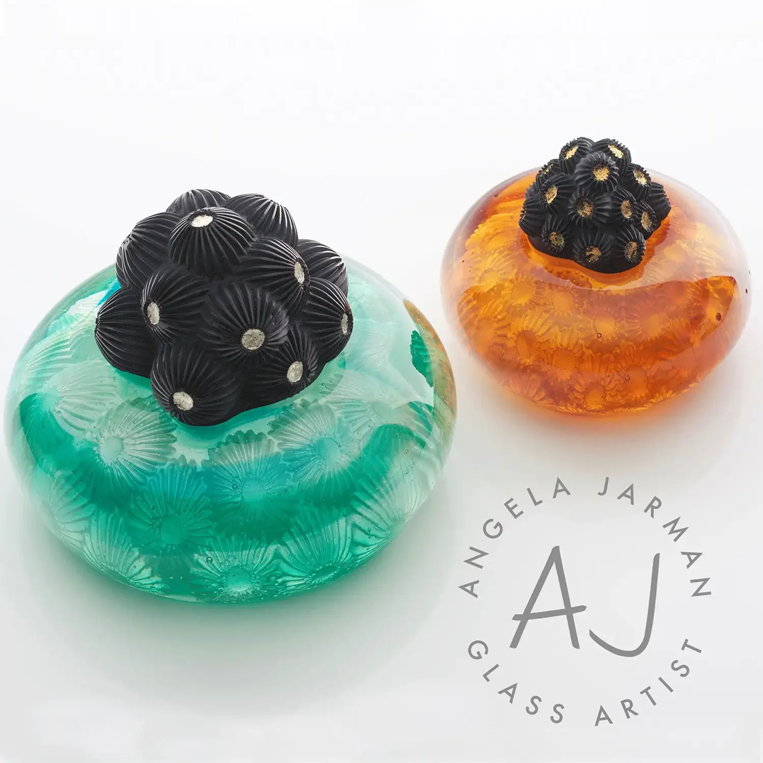
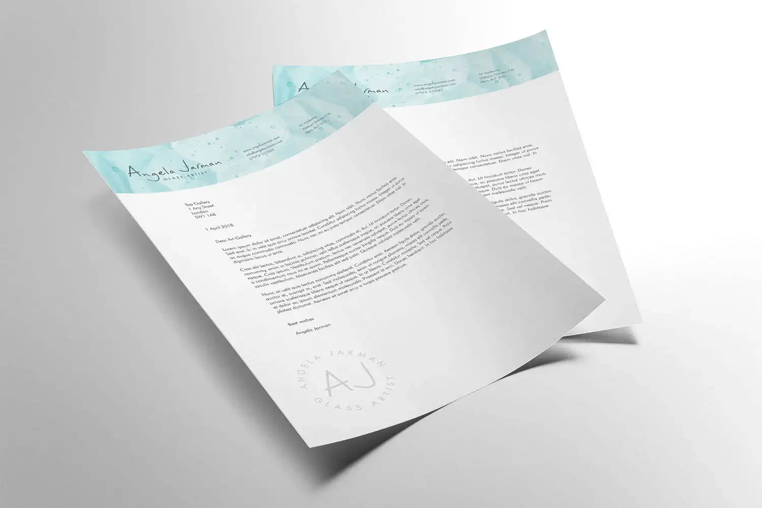
I created a modern tone that complements Angela’s distinctive style, pairing the Futura typeface (a design classic with enduring style) with a restrained, cool colour palette. The design confidently puts her art centre stage, using beautiful close-ups of the glass textures from her art pieces, adding personality and authenticity.
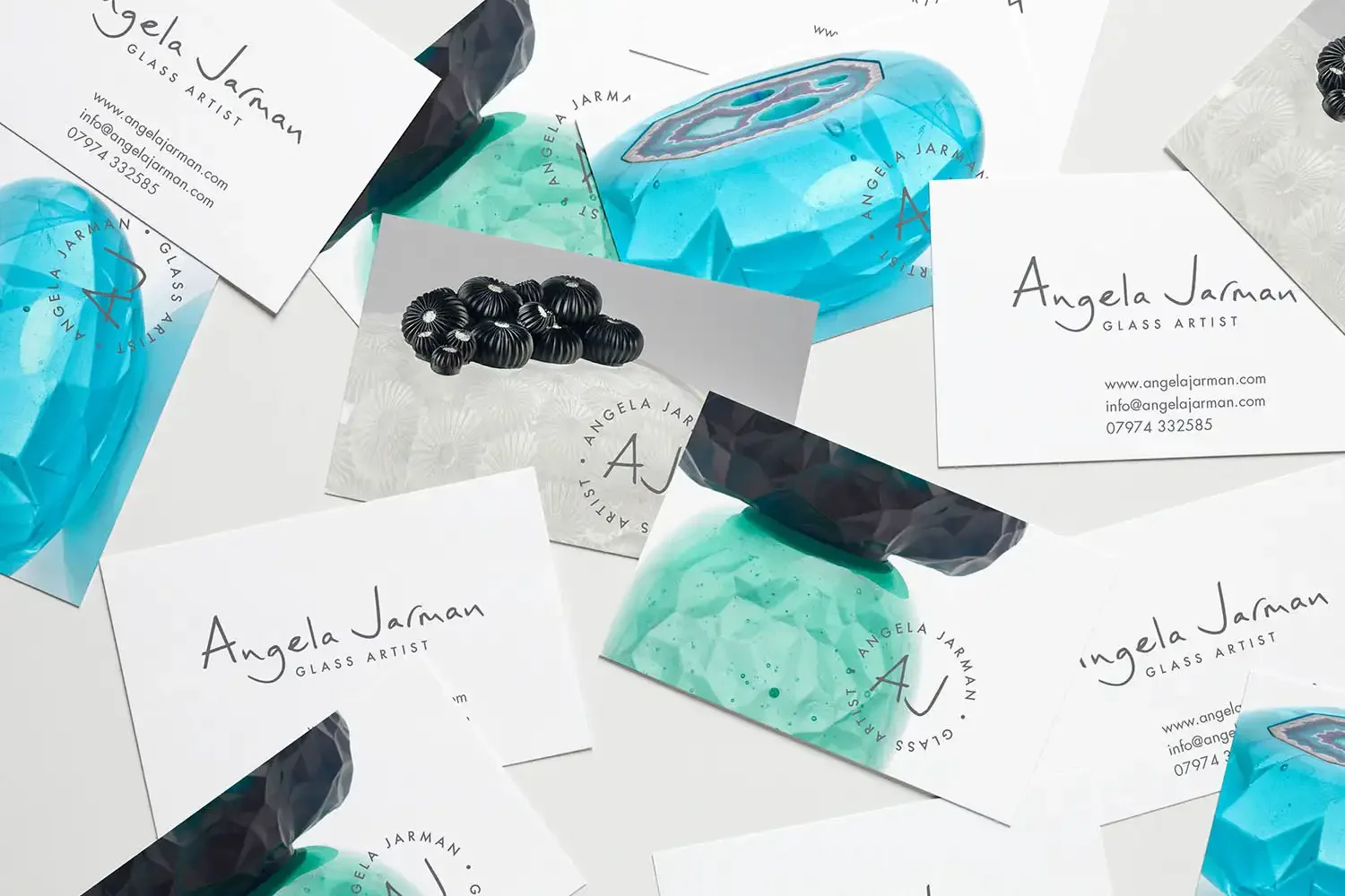
A logo design in her own hand
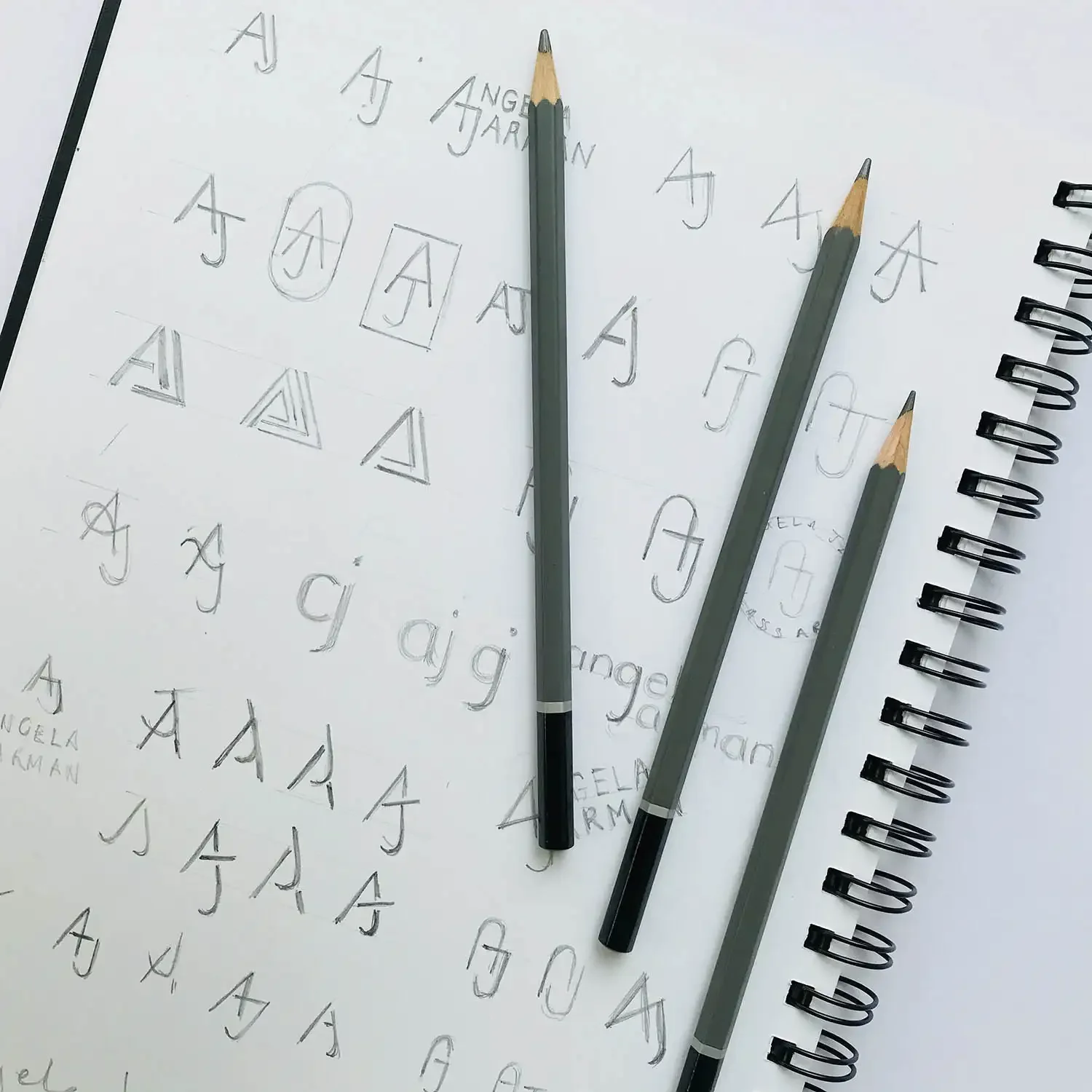
I discovered in our initial consultation that Angela engraves every unique piece she creates once it’s completed. This started as a throw-away comment, but soon became my inspiration: I suggested using her own signature as her logo. What better way than handwriting to add an authentic, personal touch to her branding? It mirrors the one-of-a-kind nature of her work and puts her name front and centre.
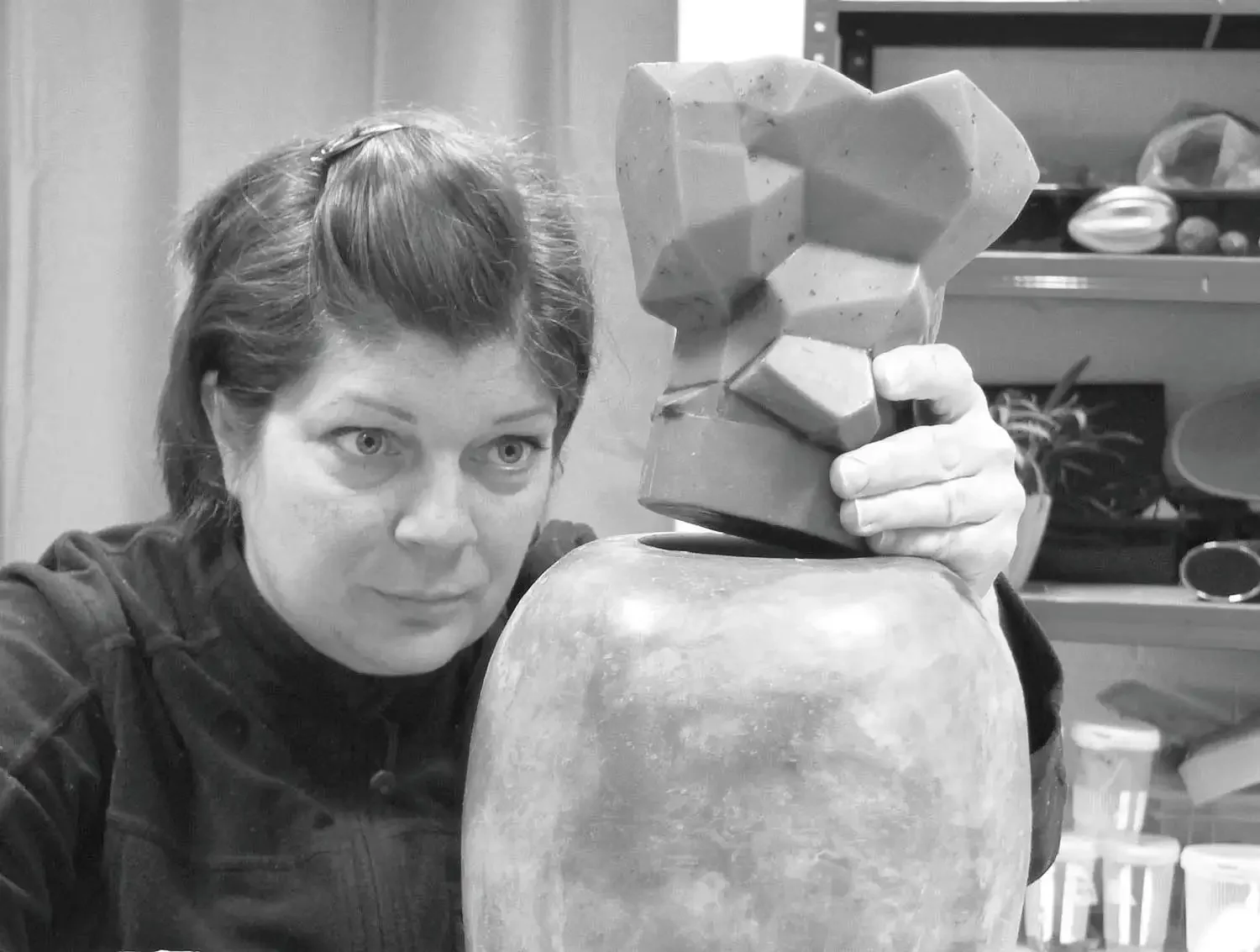
“I love all the elements of the design – my website, letterheads, choice of font, colours... everything. Thanks Andrea. Loved the whole journey.”
— Angela Jarman, Glass Artist
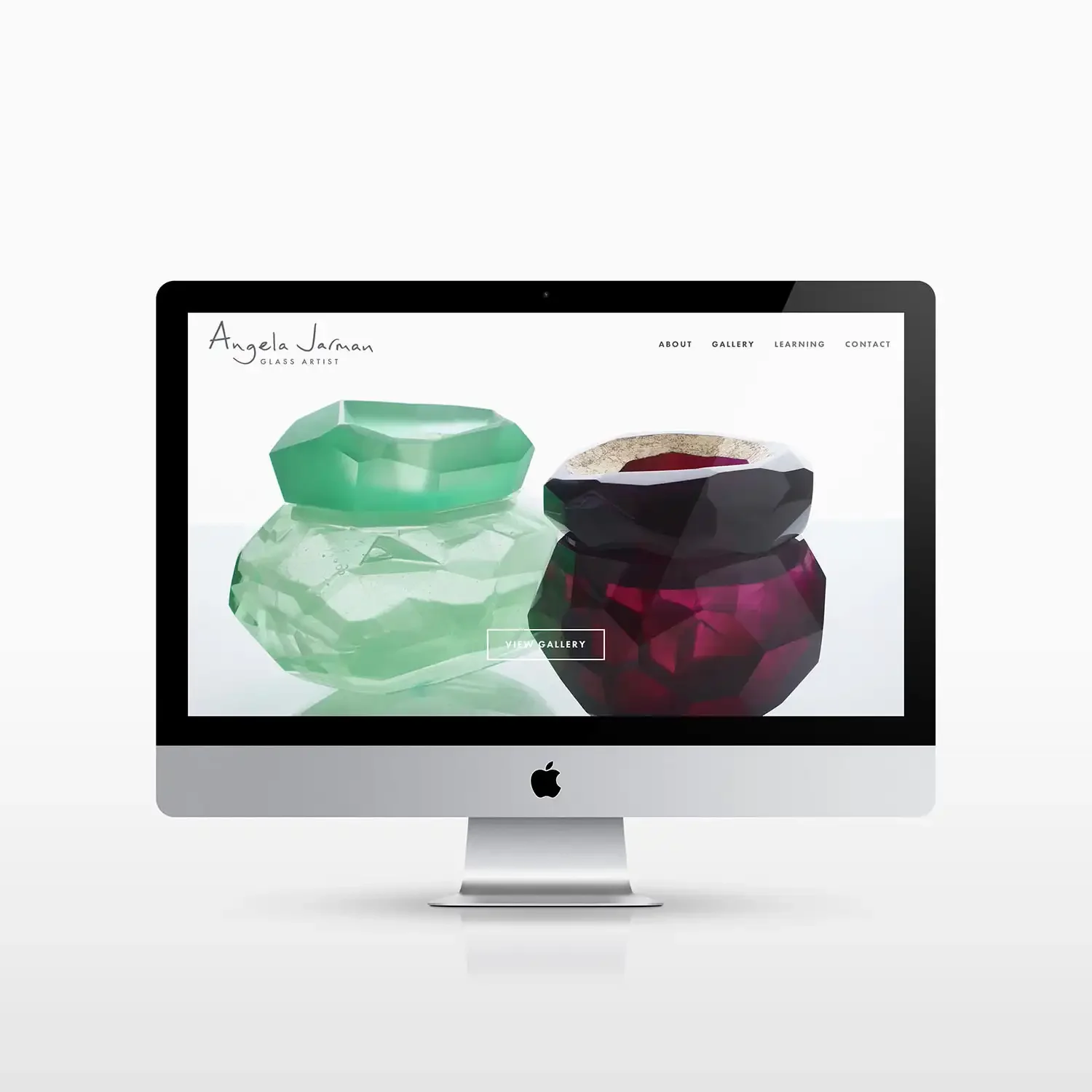
Print design and a Squarespace website
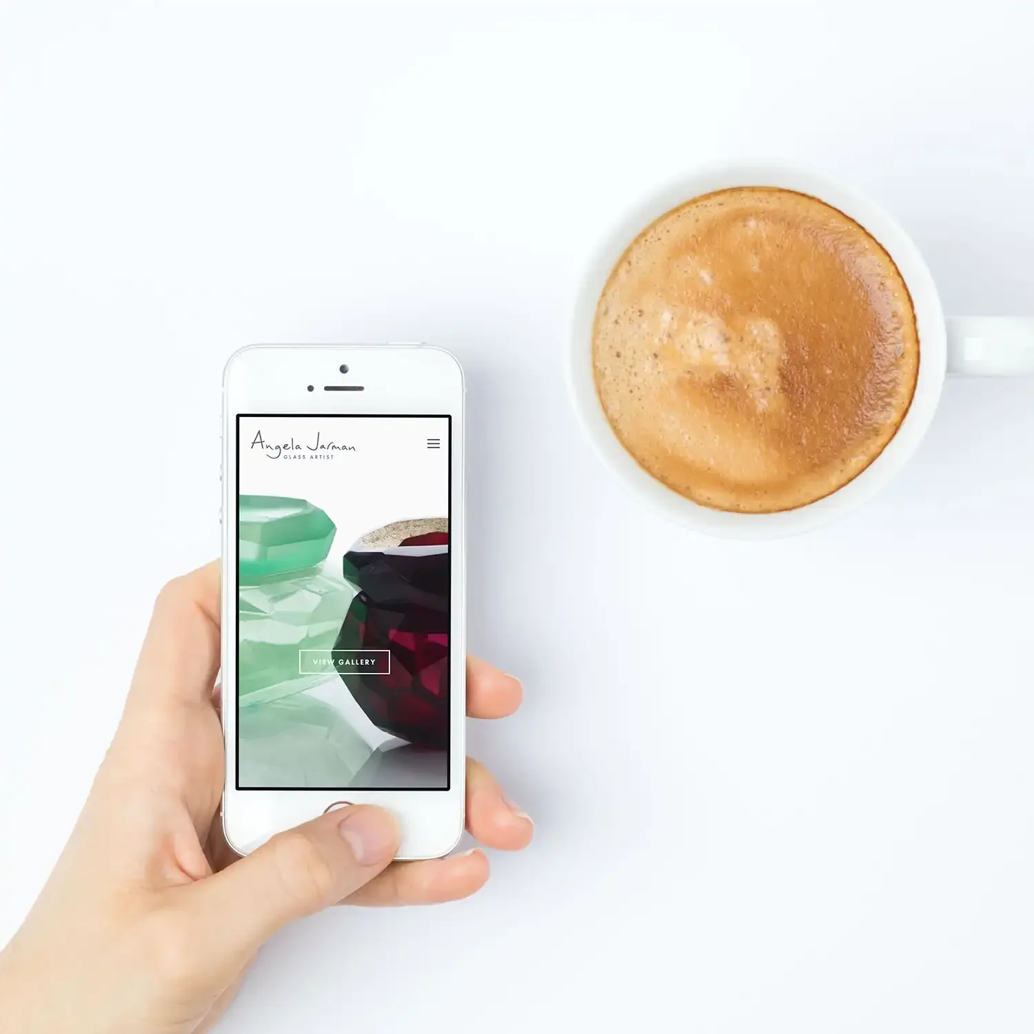
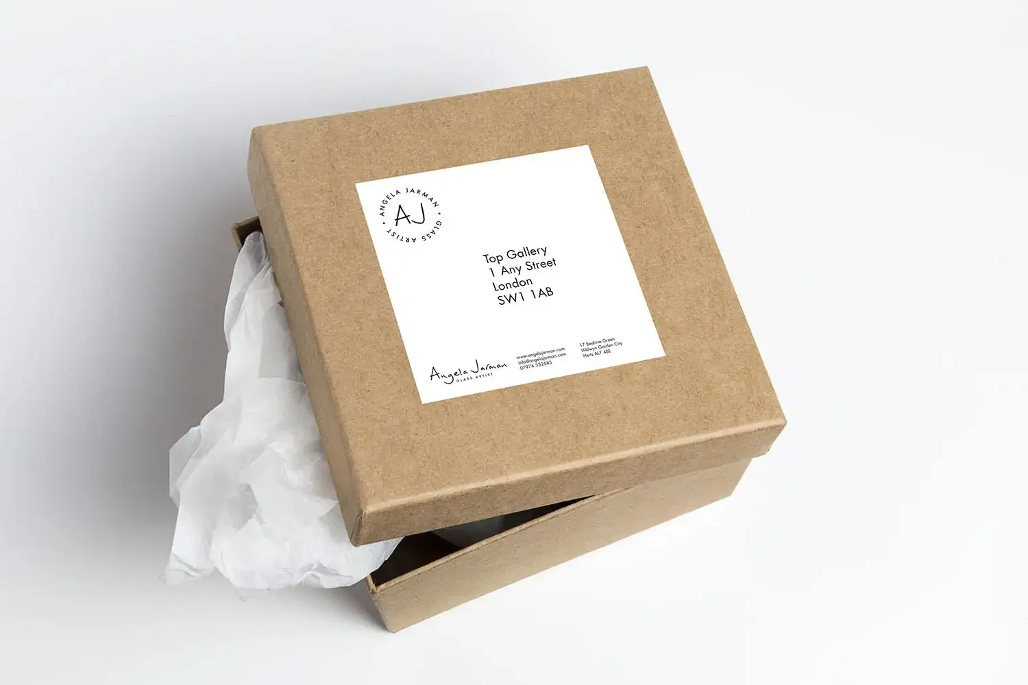
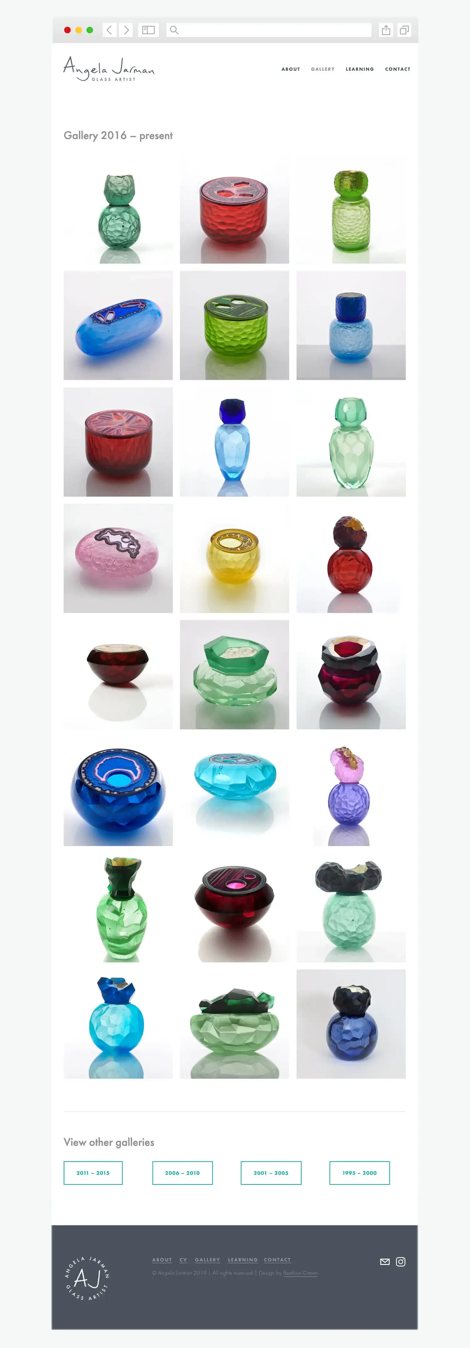
I used the visual identity to design branded print materials and a Squarespace website that showcases Angela’s entire collection. The clean website design with lots of white space gives an airy feel, making browsing her art akin to viewing it in an actual gallery. The printed business cards act like a mini gallery, showing off a range of Angela’s beautiful work.
Brand impact
Angela’s new brand clearly communicates what she does, and it works hard behind the scenes too. Her website now takes workshop bookings directly, so she’s ready to start teaching from her own studio. Her brand has given her the confidence to get visible.
Do you need a new visual identity to raise your brand’s profile?
If you have a design project you’d like to chat about or would like to understand my process better, I’d love to hear from you – please get in touch.
