Reccan
Inspiring investment in cancer diagnostics
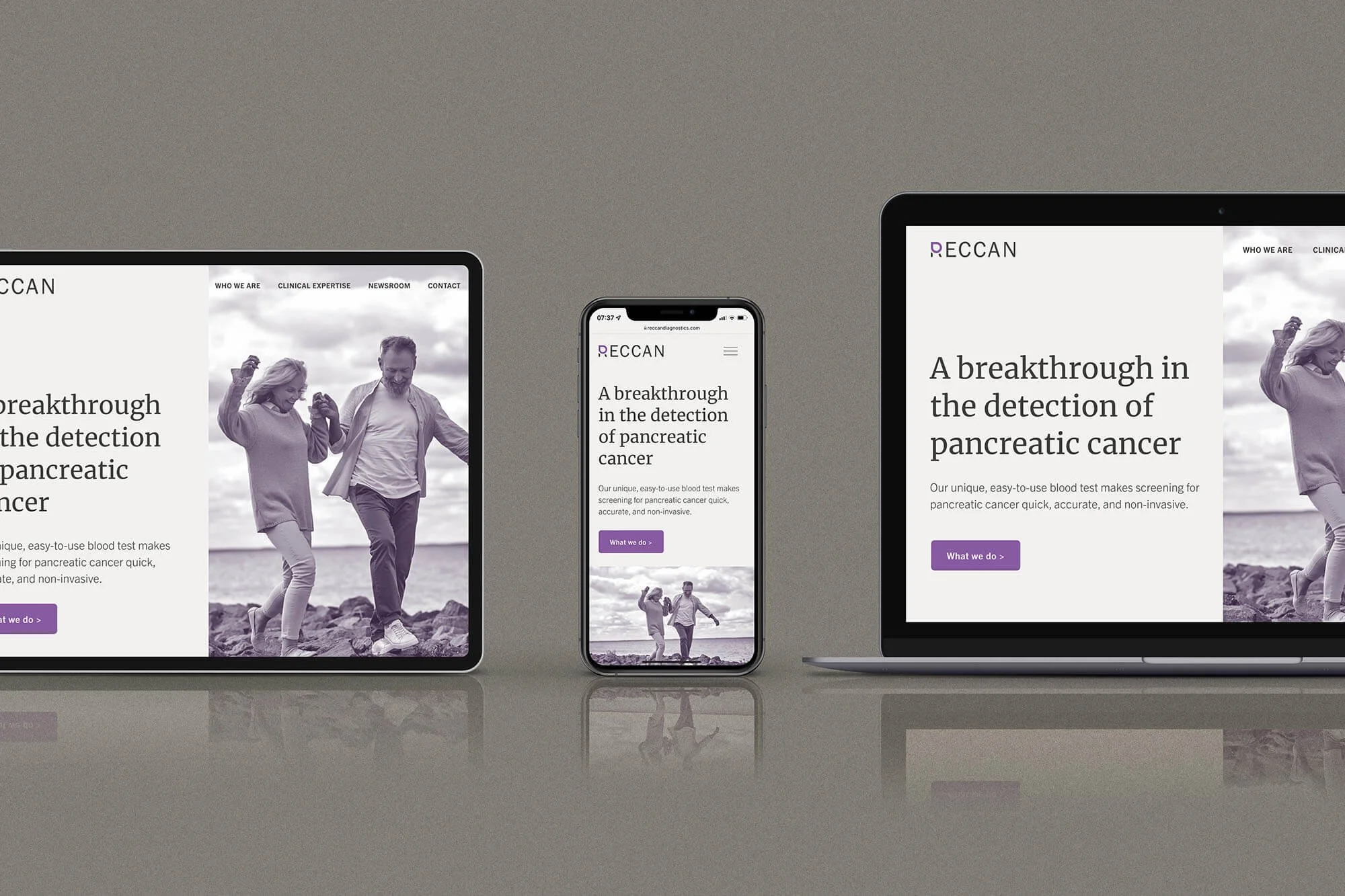
Brand identity and Squarespace website for a medtech company on a mission to save lives.
The challenge
Pancreatic cancer is often diagnosed at a late stage and has the lowest survival rate of all common cancers. Based in Sweden, medtech business Reccan is on a mission to revolutionise the detection of the disease.
The company (whose name is an anagram of cancer) has spent more than eight years developing an accessible way to diagnose pancreatic cancer with an easy-to-use blood test. This could be the key to transforming the outcomes for patients, and this simple idea of a blood test went on to inspire a core element of the new identity.
Preparing to go public, Reccan needed a brand identity to position it as a serious investment opportunity with a high value in terms both of its research and as a business. Beehive Green was chosen to work with the in-house team on brand development and design, working closely with Chief Operating Officer, Anna Brodén.
Project scope
• Logo and visual brand identity
• Squarespace website design
• Presentation deck template
• Business cards
• Social media assets

Defining a direction
Before we could develop a distinctive visual identity, we had to understand what the business needed to convey. The initial audience for the new-look brand is potential investors. Over time, it will be rolled out to the wider market and potential customers.
Through the brand discovery process we identified the basics of a brand personality and tone keywords which would appeal to both audiences:
Brand personality – trustworthy, but not dull; highly competent, but not overcomplicated; innovative, but not quirky; inclusive, but not relaxed.
Brand tone – serious, scientific, modern, restrained/understated.

A colour palette that differentiates
While the client was keen to use purple as it’s often associated with the pancreas, competitor research showed that the colour is already associated with other brands in the medtech field. With this in mind, we took a clear decision to differentiate Reccan.
A selection of distinctive neutrals form the backbone of the colour palette, giving an understated, serious tone which reflects Reccan’s positioning as the experts in detecting pancreatic cancer. As a nod to the initial audience for the brand – potential investors – we took inspiration from the Financial Times for a palette of warm neutrals. These were then cooled and muted for the final look.
Purple features as an accent colour, sitting within a secondary palette of cooler tones. It is joined by trustworthy blue and innovative teal which, used conservatively, introduce a vibrant and fresh feel that’s appropriate to the scientific and healthcare sector.

Capturing emotions with imagery
The visual identity has two tiers of imagery – hero images and real images. Ufiltered ‘real’ images reflect the clinical side of operations, while the ‘hero’ images convey the emotion of the fleeting everyday moments which Reccan will help people to experience for longer. A custom duotone effect helps create a cohesive look and feel for the brand’s hero images.


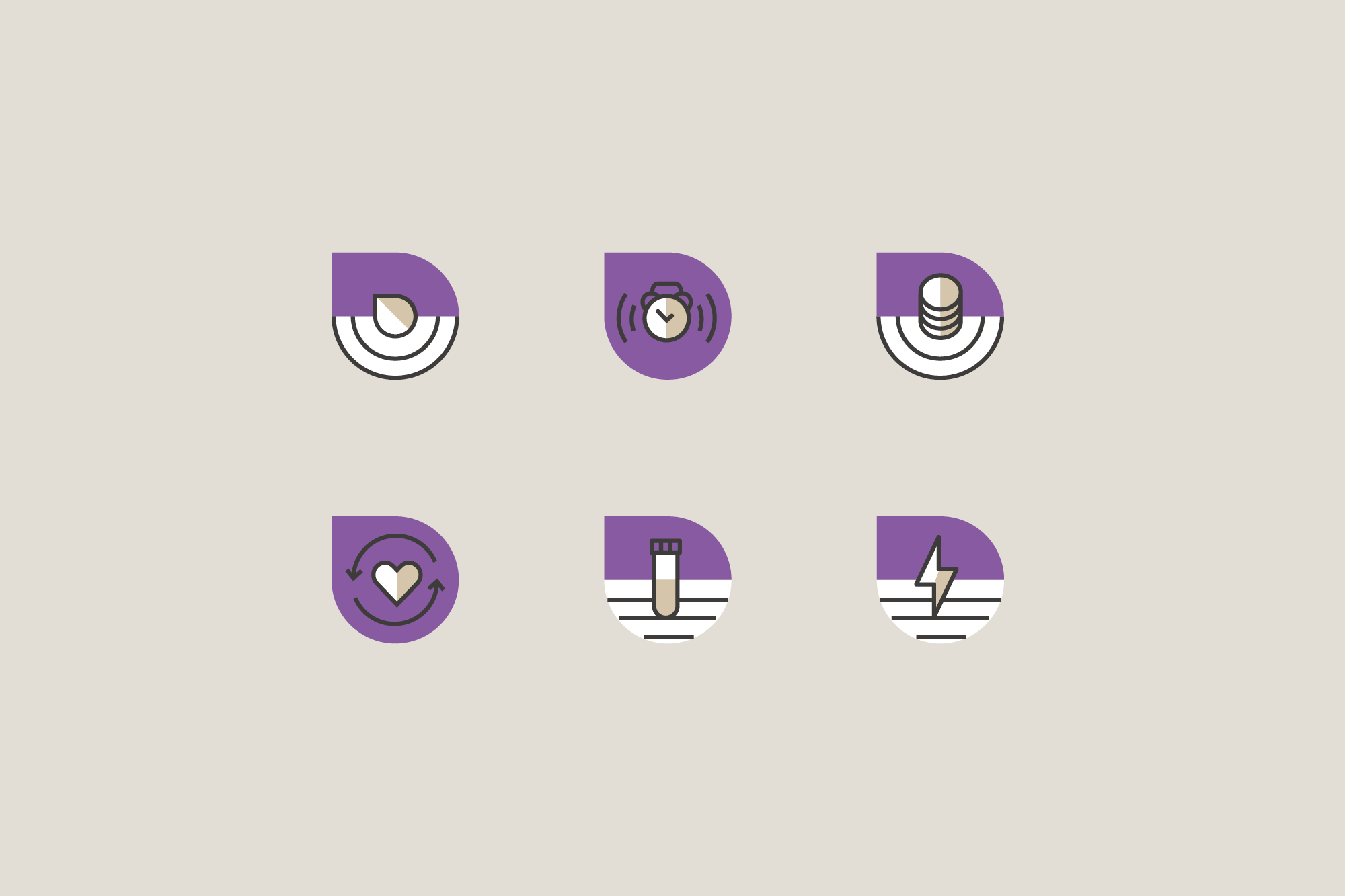
The droplet: a distinctive graphic device
Perhaps the most recognisable element of the new brand identity is the ‘droplet’ graphic device.
The droplet was chosen to show the simplicity and convenience of diagnosing pancreatic cancer with a blood test, and its distinctive shape makes the brand identity readily recognisable.
The droplet device appears in the logo design, forming the top of the initial R to create a distinctive wordmark. This application is carried through to the brand’s new submark.
The droplet appears right across the visual identity in a variety of forms and colours. It’s used as an illustrative element, image frame, in patterns and as the basis for a set of brand icons.

Design to boost credibility
With a strong, memorable brand identity agreed, it was time to roll it out across the company’s communications.
From a bespoke new Squarespace website and custom slide deck template to social media assets and professional business cards, the new look for Reccan positions it perfectly to attract investors and get the funding they need to bring their life-saving product to market.

Client feedback
“Andrea has done a great job. We’ve gone from a small company with no overall idea of brand to having a professional brand identity that can easily grow with our future needs. Investing in our brand has transformed the impression our company makes. We’re proud of what we now present, with good templates as a base for our communications and a clean, focused website.”
— Anna Brodén, Chief Operating Officer, Reccan

Set for success
It was a real privilege to work on this project. It was a great cause with a fantastic, innovative client, and it also allowed me to play a small part in supporting a brand that’s bringing hope for defeating cancer. And that’s something to celebrate!

