New work: An uplifting brand identity for contemporary artist Paula Cherry
If you’re an artist, your work is at the heart of your brand. So how do you get a brand identity that supports you commercially while letting your art take centre stage? Read on…
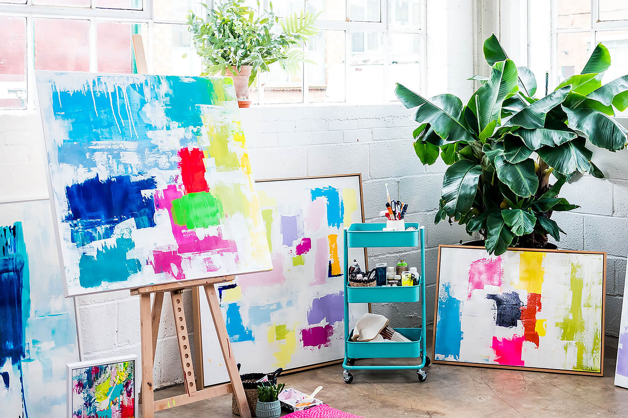
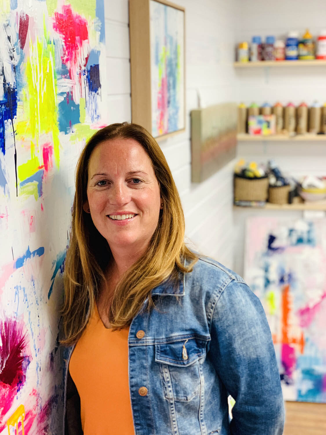
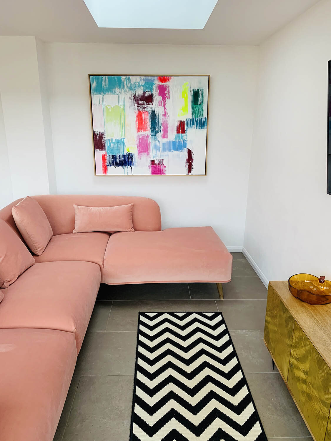
Hertfordshire-based abstract artist Paula Cherry is known for her bold, colourful paintings and one-of-a-kind art commissions that bring interiors to life. Her distinctive style evokes happiness and joy. The Paula Cherry brand is contemporary and aspirational – she’s grown quite a reputation!
In Paula’s words, “Each painting is a process of discovery. I build on layer upon layer, adding texture and creating glimpses of hidden colour and pockets of curiosity.”
Paula’s signature style speaks for itself, but a new residency at Brothership Studio in Hertford called for a brand that would better help her commercially.
The creative brief
Paula wanted a brand identity so support her work as an artist, making her passion a sustainable long-term business. I had previously connected with Paula on Instagram and was over the moon when she asked Beehive Green for help!
Together, we agreed she needed a basic brand identity with logo, colour palette and typography to define a strong look for her brand and the right tools to market her art. The brief was to design a branding system that feels bold, happy, confident, colourful, contemporary and original, in keeping with Paula’s style.
Brand identity design
Paula Cherry is a serious artist and her artwork is at the centre of her brand. This was why, despite her fabulous name, we quickly ruled out playing on using a cherry as part of her visual brand identity. We felt that was too obvious and twee.
Instead, I designed the visual identity to support the ‘happy and uplifting’ vibe of her brand personality, making sure the emphasis is on her artwork.
As luck would have it, Paula’s signature lent itself to the perfect logo design. As soon as I spotted the smile in the ‘y’ descender of her handwritten signature I knew that was the right choice to represent her brand. That smile is also an ideal position for her brand descriptor ‘abstract art’ to sit within. This logo is unique to Paula and a mark of quality. Just like her artwork, her logo is completely original, with personality and energy.

When it came to curating a brand colour palette, less was most definitely more. Neutral black and white are used primarily for logos and typography so as not to compete with Paula’s colourful work. But a secondary palette of intense, bright colours are available – lemon, fuschia, azure and sky. These capture the happy spirit of the Paula Cherry brand and are useful when it comes to packaging design or creating marketing communications. The brand’s typography features a font with a rounded, geometric style and minimal feel that is both approachable and stylish in appearance.
The brand is supported with beautiful photography by branding photographer Alison Burrows, showcasing Paula in action and inspiring interiors which feature her work.

“I absolutely love my new brand identity! The logo, fonts, colours... it all works so well together. As an artist I wanted a brand that was led by my art. So we used my signature as the logo, keeping it simple. I chose the entry-level branding package but there’s nothing basic about Andrea’s service. Everything she’s done is amazing in quality and depth. I’ll definitely be calling on Beehive Green again for design help. Thanks so much Andrea, it’s been great working with you!”
Paula Cherry, Abstract Artist

Building out the brand
I implemented the brand identity on business cards and a series of promotional postcards that act as a mini art gallery to display work, as well as creating mockups of marketing items Paula could potentially use in future to promote her work.
Then, to wrap up the project, I designed a brand style guidelines document. This manual explains how to use individual brand elements and the identity as a whole. It can be referenced by everyone who promotes the brand, internally or externally. As Paula is supported by a team of creatives, including a copywriter, these have been invaluable to share with them and create brand consistency.

Brand impact
I adore Paula’s artwork and was delighted to create this visual identity that complements her work. Since having a solid brand identity, she’s been able to apply a consistent look to her communications, including a new commerce website.
Paula has raised her profile by having a strong, confident brand. She’s since gone on to a new residency at The Courtyard and now has a permanent home studio. To top it off, she’s in high demand and has sold lots of her artwork. Win-win!

Do you need a new visual identity to raise your brand’s profile?
I’m always keen to meet new clients and to hear about your branding challenges. If you have a design project you’d like to chat about or would like to understand my process better, I’d love to hear from you. Please get in touch!